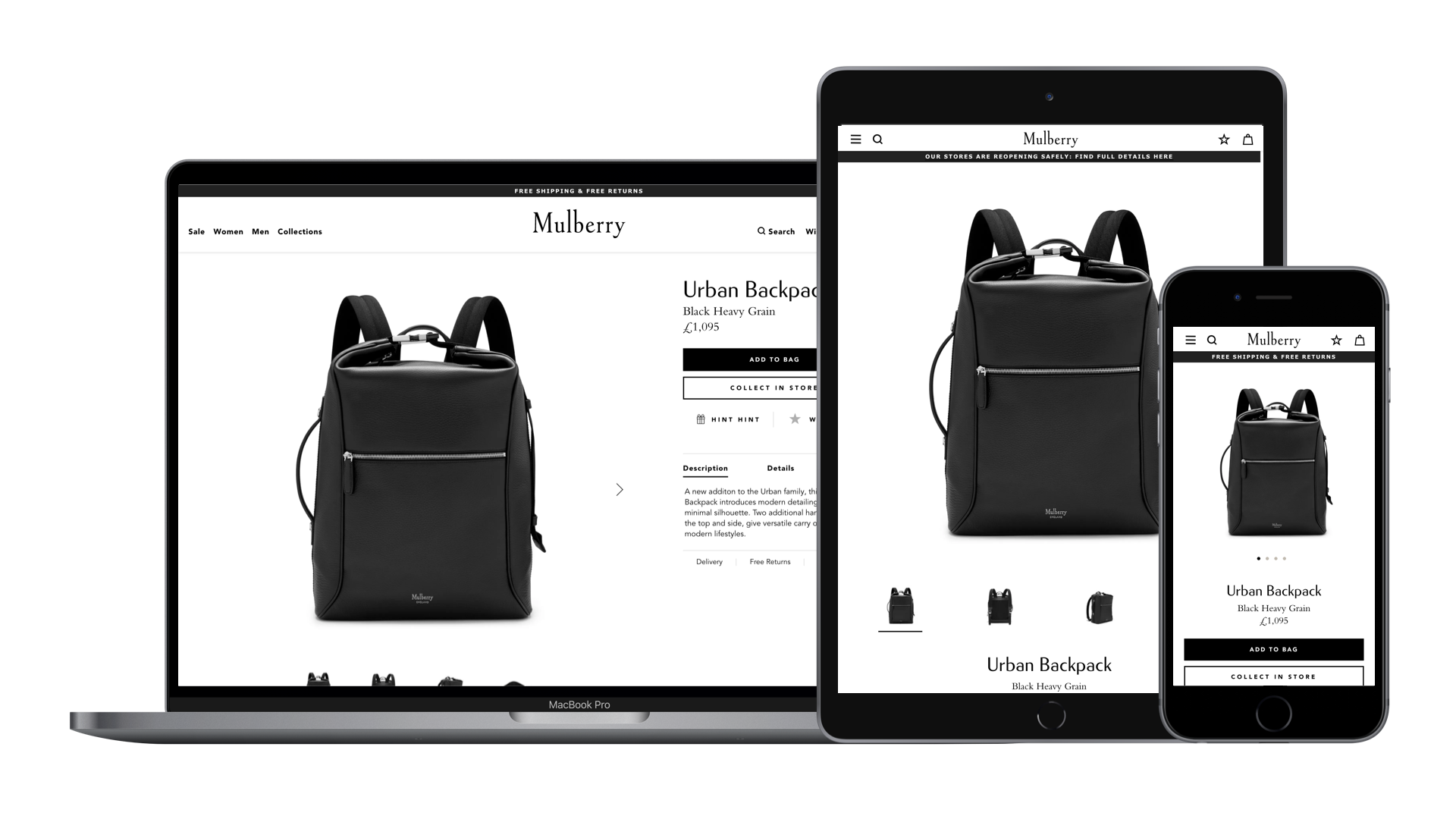
- URL: mulberry.com
- Client: Mulberry
- Date: May 2016
- Duration: 1 week
- My Role: UX Designer
- Deliverables: Heuristic evaluation, UI audit, analytics review
The Mulberry website was redesigned in 2016 by King & Partners to accompany a refreshed brand direction. Mulberry wasn't 100% happy with the website's UX and therefore contacted me to conduct a review.
I provided them with an objective audit combining a heuristic evaluation, UI audit and analytics review.
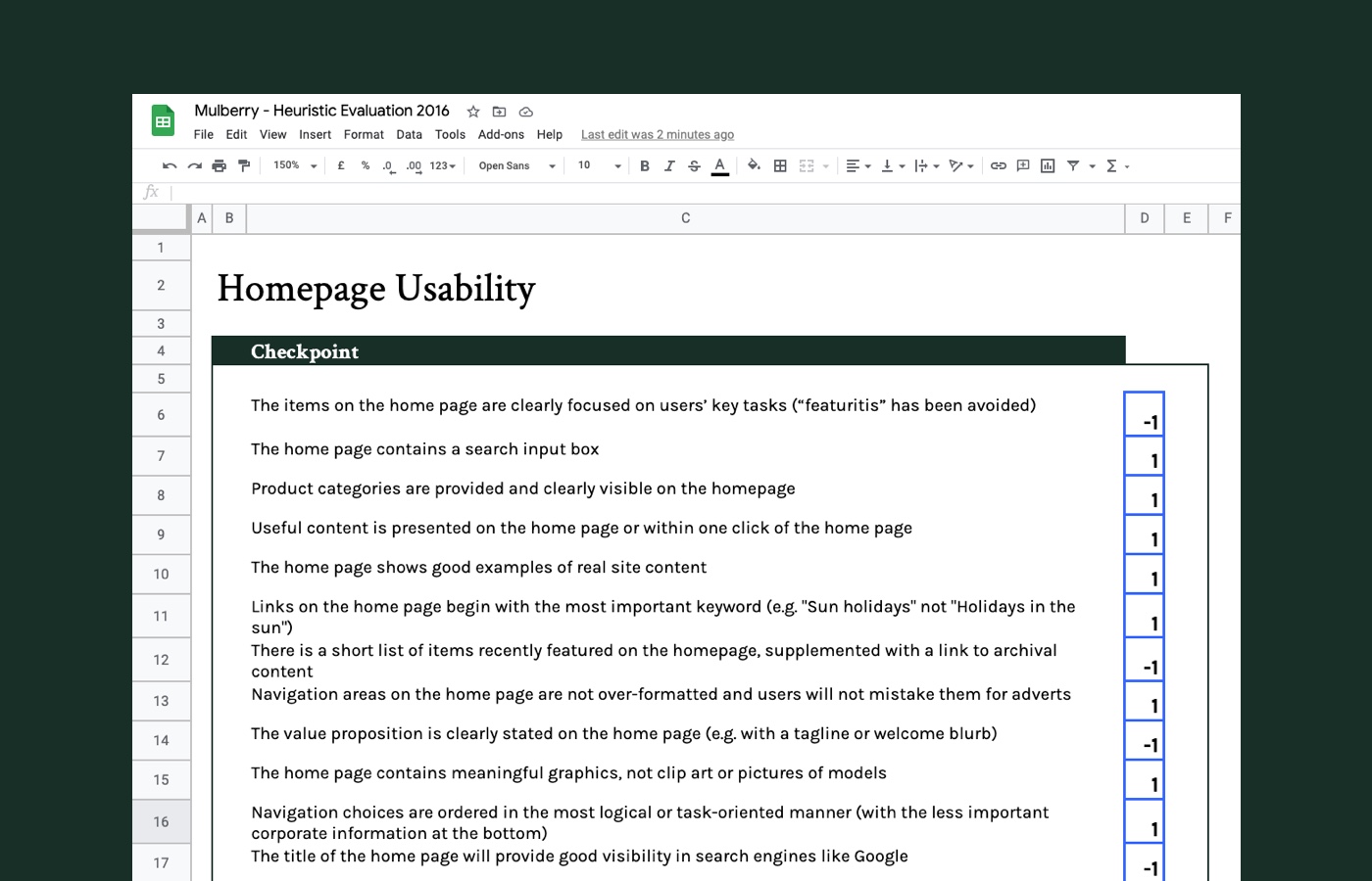
Heuristic Evaluation
I conducted a heuristic evaluation by reviewing specific aspects of the website against a list of nine usability heuristics:
- Homepage Usability
- Task Orientation
- Navigation & IA
- Forms & Data Entry
- Trust & Credibility
- Writing & Content Quality
- Page Layout & Visual Design
- Search Usability
- Help, Feedback & Error Tolerance
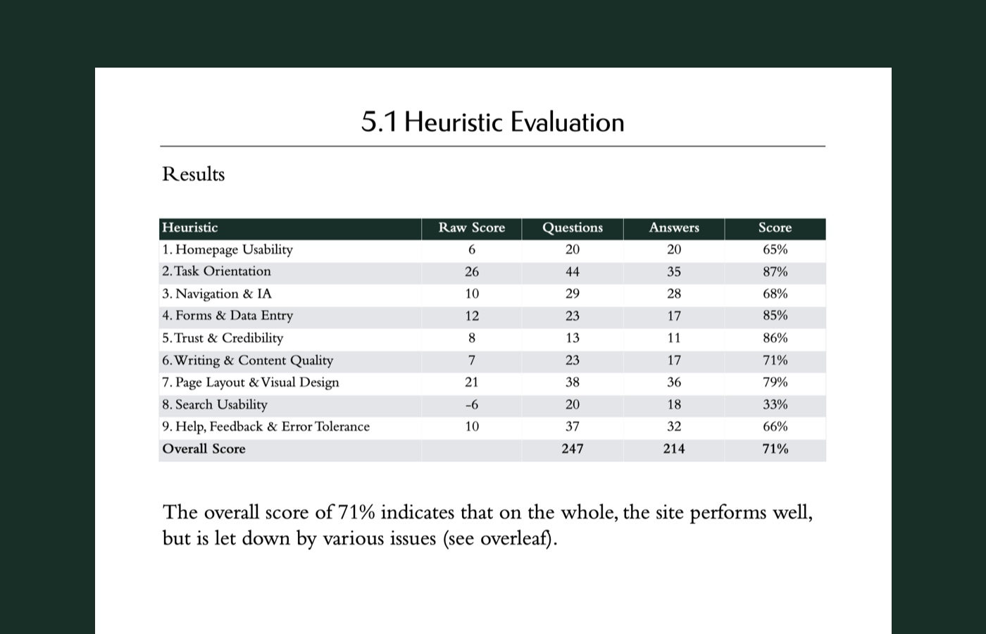
Insights
The results of the evaluation gave an overall score of 71%. This indicated that, on the whole, the site performed well, but was let down by several issues:
- Poor navigation on mobile and tablet
- A lack of brand and product stories
- Few lateral journeys from product to product
- Poor search functionality
- A static homepage with limited content variations
- Unoptimised data inputs that increased user error and abandonment
- The lack of extra polish you would associate with a luxury brand
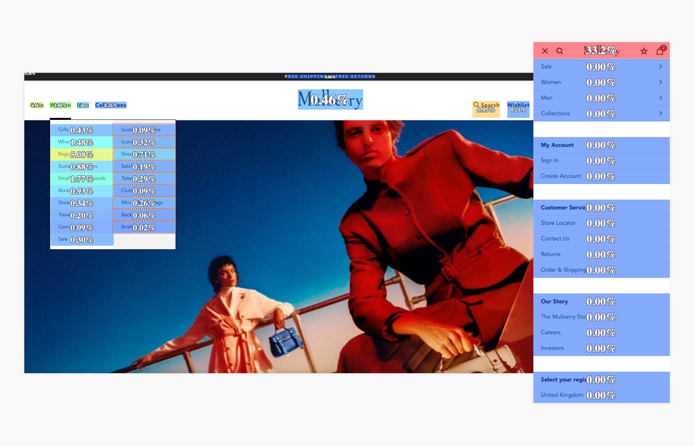
UI Audit
I undertook a UI inventory to gain insights into the consistency of the existing user interface. All UI elements were captured and then categorised into groups: Buttons & Icons, Modals, Header & Footer, Forms, Typography, Imagery.
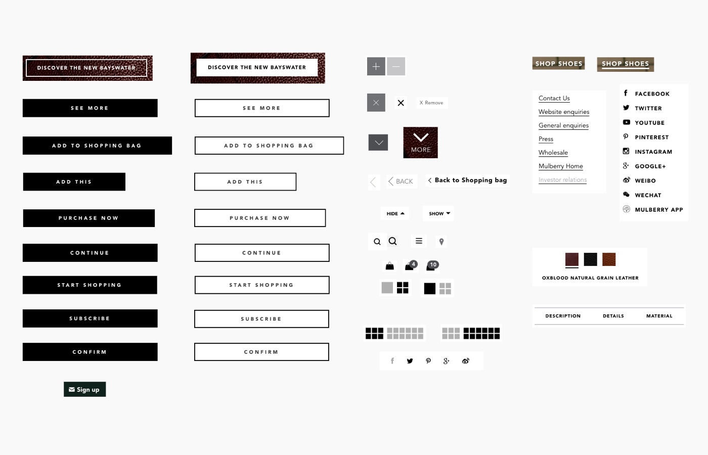
Key Insights
The results of the UI audit suggested that, on the whole, the site had a consistent ‘look and feel’, but there were areas that could be improved. These included:
- Lack of interactivity
- Challenges with the photographic aspect ratio
- Consistency and legibility of typography
- Missing states from navigation items
- Consistency of button/icons styles
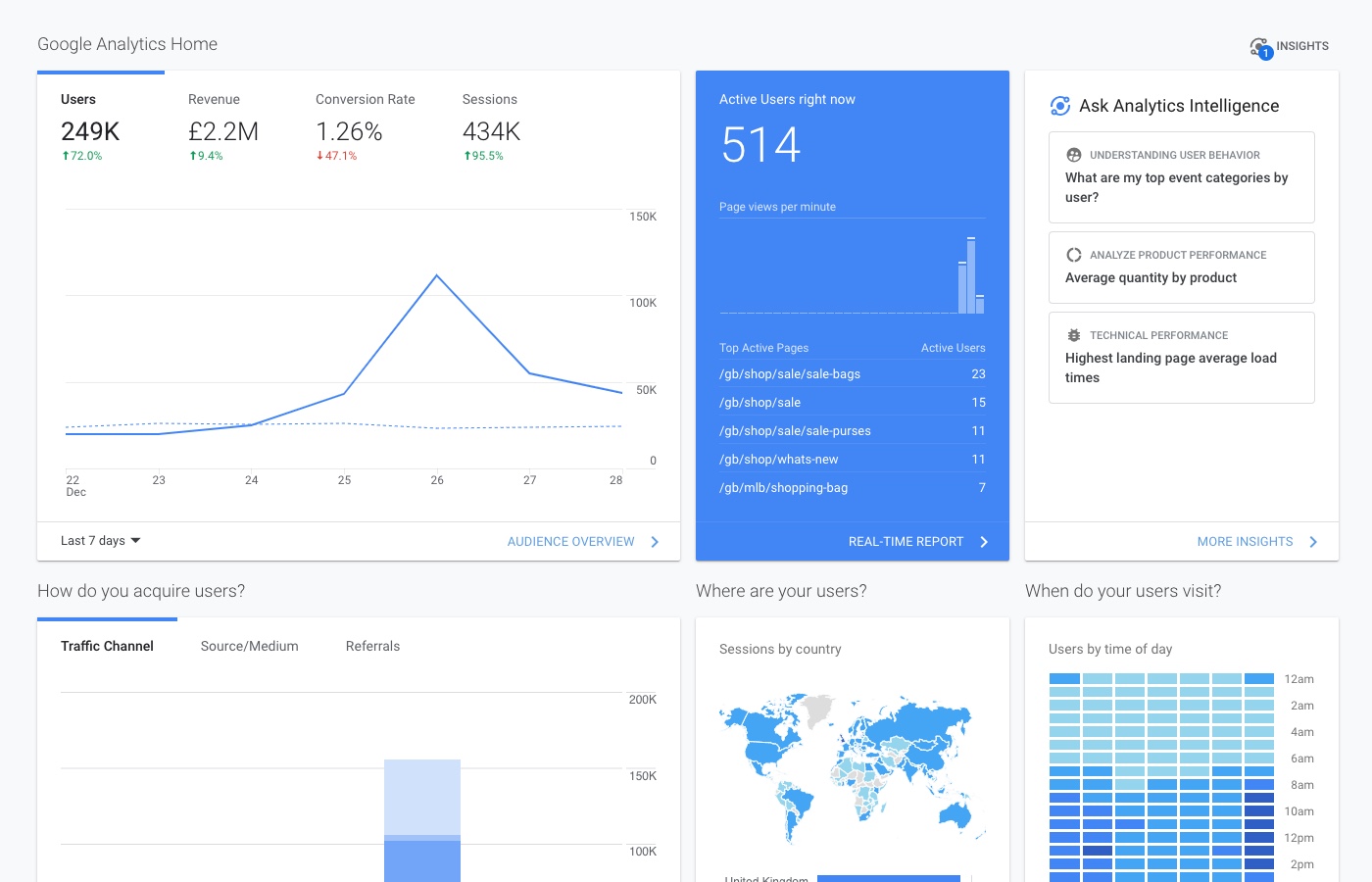
Analytics Review
I reviewed the site analytics to ascertain if there were any issues with how users were navigating the site. I used Google Analytics, Google Page Speed Tool and Google Heat Maps & Event Tracking.
Key Insights
Many users exited the site on product listing pages. This suggests they were either not finding what they wanted, or drilling down to product details pages, only to return to listing pages and then exit.
Although the majority of users visit on mobile, their degree of engagement/willingness to purchase is lower than on tablet/desktop.
Google Page Speed Insights suggests various technical improvements around compression and minification.
Size of tap/click targets should be increased to make it easier for users to select the right link and avoid errors.
Concluding Thoughts
Concluding Thoughts
Concluding Thoughts
The audit highlighted a number of ways in which the UX of the Mulberry website could be improved: navigation, interaction, task-based/functional, content enrichment.
This initial contract led to an ongoing programme of UX improvements where I implemented many of the recommendations mentioned in the audit.
Projects to date have included the redesign of both the Shopping Bag and Checkout experiences, as well as the addition of new site features such as Wish List and Send to a Friend.
Furthermore, I now provide Mulberry with monthly UX support across the majority of their digital projects.