- URL: mulberry.com
- Client: Mulberry
- Date: May 2016
- Duration: 1-2 weeks
- My Role: UX Designer
- Deliverables: Wireframes, interactive prototype
I worked alongside the in-house team to set up the UX improvements programme at Mulberry. Its purpose is to increase customer satisfaction, brand loyalty and conversion through iterative, design-driven design.
This is the story of how we improved the mobile customer experience as a key part of the programme.
Web Analytics Insights
With over 51% of website traffic (May 2016) originating from mobile devices, one key focus was the improvement of the mobile experience and more specifically the mobile navigation.
At the time of writing we didn't have an advanced analytics package in place (we now have Content Square, Hotjar or Optimizely), so we relied on data from Google Analytics.
56% Sessions
26.4% Bounce Rate
3.78 Pages/Session
2 Session Duration (mins)
29.1% Transactions
0.14% Conversion
0.14% Conversion

UX Audit Insights
In conjunction with the data analysis, the 2016 UX Audit highlighted several problems on mobile devices:
- Poor sign-posting and affordances
- A poor spatial model & affordances to signify hierarchy
- Poor label legibility (through use of small font sizes)
- Confusing access to the site search
Competitor Analysis
In addition to reviewing our own analytics and audit, I also undertook a competitor analysis to establish insights into best-practices.
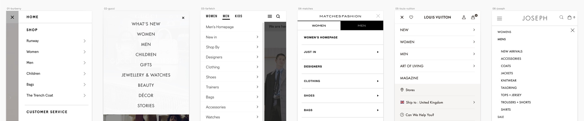
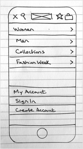
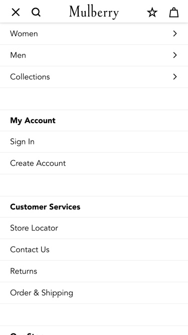
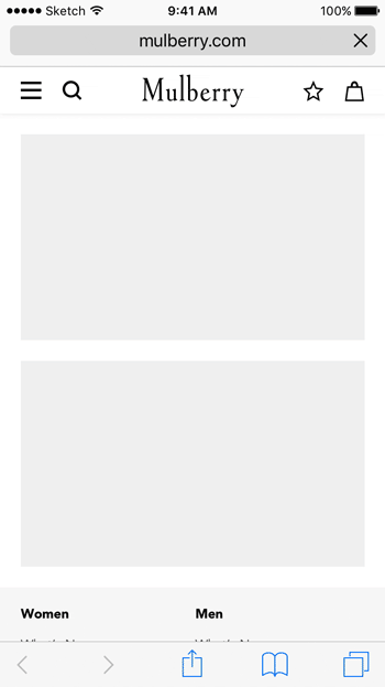
Existing Navigation (April 2016)
The existing mobile navigation had a confusing structure, no affordances to indicate to users that there were sub-navigation options available, and a back button positioned on the wrong side (right-hand side).
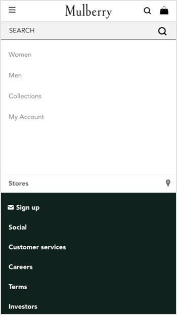
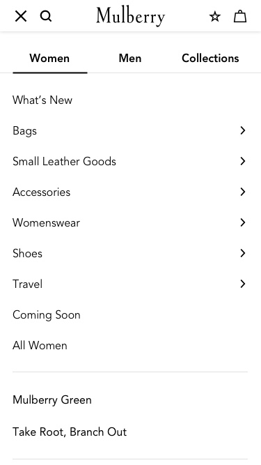
This displays the main categories for Women, Men, Collections and My Account.
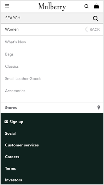
Level two provides access to the sub-categories once the user has selected 'Women'.
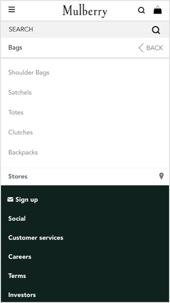
Finally, level three shows the tertiary level options within 'Women's Bags'.
Animation showing the spatial design for the existing mobile website navigation.
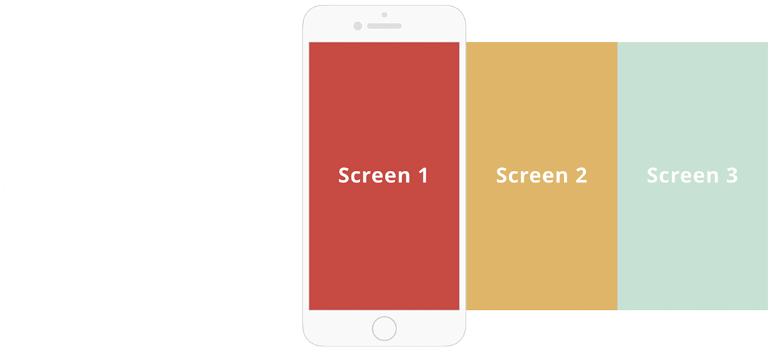
Existing Spatial Model
Well-designed mobile apps use considered movement and spacing between elements. This creates a spatial model that helps the user orient themselves within the experience.
The existing navigation had a poor spatial design for each menu within the hierarchy. All elements were stacked on top of each other and were revealed/hidden when the user interacted.
This coupled with a lack of animation, resulted in an abrupt feeling when the user toggled between states.
Hypothesis
Based on the data and audit insights we developed the following hypothesis:
By improving mobile navigation, users will be able to find product information more easily. This will result in lowering the bounce rate and increasing the percentage of successful transactions on mobile devices.
KPIs
- Bounce rate
- Conversion rate
- Successful transactions
Design Exploration
To test our hypothesis I explored two navigation options:
Option 1
Retaining the existing menu structure, but introducing additional affordances such as arrows to indicate sub-categories. This ensured that users could distinguish between these and normal links and thus improve discovery of the sub-category items.
Option 2
To improve the discoverability of secondary and tertiary items I introduced a tabbed approach that displayed sub-categories from a selected category without requiring the user to drill-down into a specific category.
Additional Changes
For both options, I also increased the font size to make the navigation easier to scan.
Pre-existing navigation
Early rough sketch of option 1
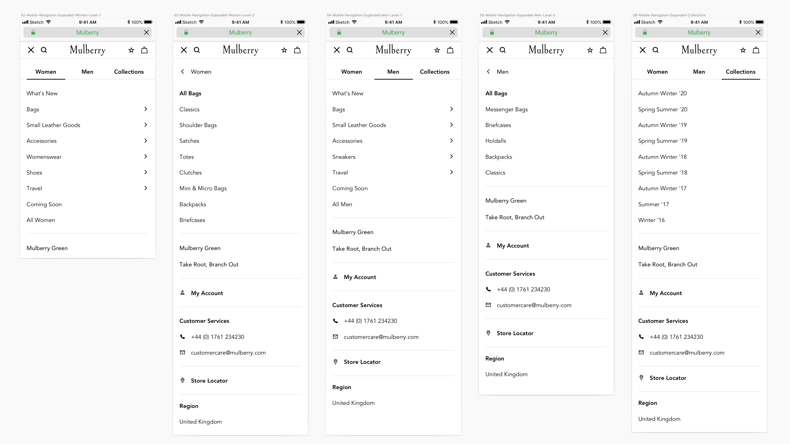
Option 1: Drill-down navigation
Option 2: Tabbed navigation
Wireframes
I then mocked-up key screens to demonstrate the user journey through the navigation.
New Spatial Model
Understanding what's currently in the viewport, what has left the viewport and what's next helps users orient themselves within the experience.
I redesigned the horizontal placement of the menus within the hierarchy and combined this with simple transitions between states. This created an improved spatial model for users and improved usability.
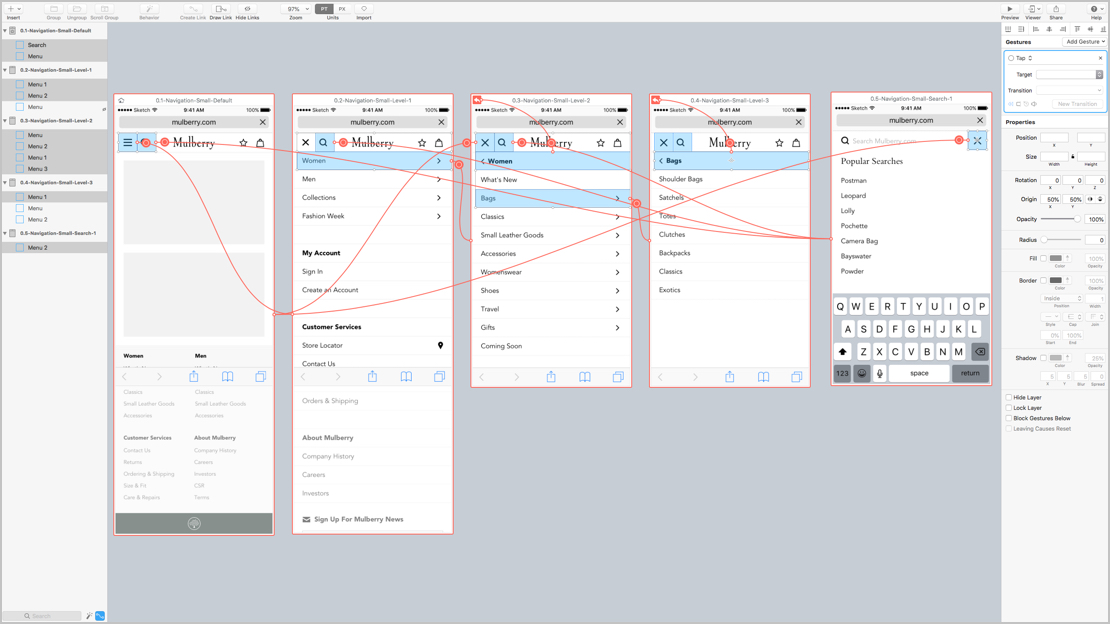
Flinto Prototype
I used Flinto For Mac to create a high-fidelity prototype using the static assets that I created in Sketch. The prototype was used to communicate the behaviour of the UI to internal stakeholders within Mulberry. It also acted as a visual reference point for the external development team to develop their codebase.
Redesigned Search
User’s who know what they are looking for are more likely to use search, rather than taking time to browse through hierarchical navigation.
Separating search from the navigation options with a dedicated screen reduced visual clutter. This ensured users could focus on either browsing or searching more effectively.
Final Prototype
The final mobile navigation prototype enabled us to preview and test on a variety of devices.
This has now been developed and is live on the main Mulberry website.
Final Prototype
The final mobile navigation prototype enabled us to preview and test on a variety of devices.
This has now been developed and is live on the main Mulberry website.
Key Findings
Comparing the same top-level metrics from May 2018 against May 2018 indicates that, on paper, the redesign was a success.
62.5% Sessions
24.6% Bounce Rate
3.9 Pages/Session
2.19 Session Duration (mins)
39.7% Transactions
0.19% Conversion
Caveat
Although the data above points to an improvement, there could have been other factors that have influenced the outcome. Unfortunately due to the absence of specific event tracking and goals, we couldn't isolate the mobile navigation metrics as well as I would have liked. This is a key learning for future projects.
Additional Tools
In addition to improving our event tracking and goals in GA, there are some additional tools that I have incorporated into our design process:
We use the heatmap and recordings functionality to measure levels of user engagement.
We have started testing certain module variations on PDPs to determine which creative execution delivers the highest level of engagement.
The HEART framework helps provide me with a consistent approach to defining KPIs as part of the early phases of UX strategy.