- URL: Apple App Store, Google Play Store
- Client: Moncler
- Agency: B-Reel (Barcelona)
- Date: July 2020 - April 2021
- Location: Remote (UK, Spain, Sweden & Italy)
- Duration: 8 months
- My Role: UX Designer
- Deliverables: Sitemap, user flows, wireframes, prototypes
Moncler is an Italian luxury fashion brand renowned for its iconic outerwear and being at the forefront of innovation.
Against the backdrop of the global pandemic and changing consumer habits, Moncler sought to create a highly personalised and engaging mobile app.
At its core, the app aims to make life easier for customers wishing to purchase products and engage with them through personalised content, events and services.
Having previously worked together on both Carolina Herrera and Our Planet, B-Reel Barcelona contacted me to lead the UX design for the project.
Project Background
Moncler engaged IDEO to develop a high-level service design strategy as part of their digital transformation initiative. This strategy highlighted opportunities for the Moncler website and mobile app to serve as key digital touchpoints within a wider ecosystem.
The website (designed by R/GA) provides an accessible centre point for e-commerce and editorial content whereas the mobile app focuses on a more exclusive, elevated and personalised customer experience.
Our main challenge was to take the work developed by R/GA, optimise it for native mobile technology, and also bring something new and unique to the table to ensure the mobile experience delivered added value to Moncler customers.
Key Features
As part of my role as UX designer, I helped the B-Reel design team distil client requirements into a set of key features for the mobile app.
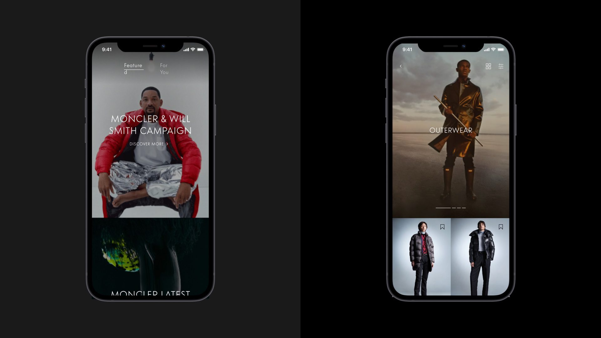
Personalised Home Feed
To increase engagement and relevance, the home feed provides a personalised entry point into the mobile app through a blend of product and editorial content.
As engagement increases over time, this content is tailored to suit specific user needs, thus increasing chances of conversion.
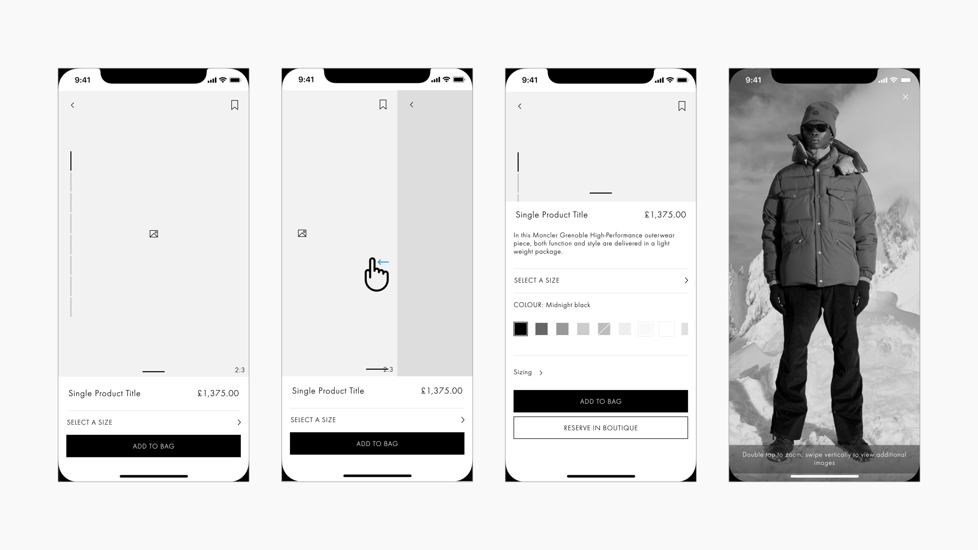
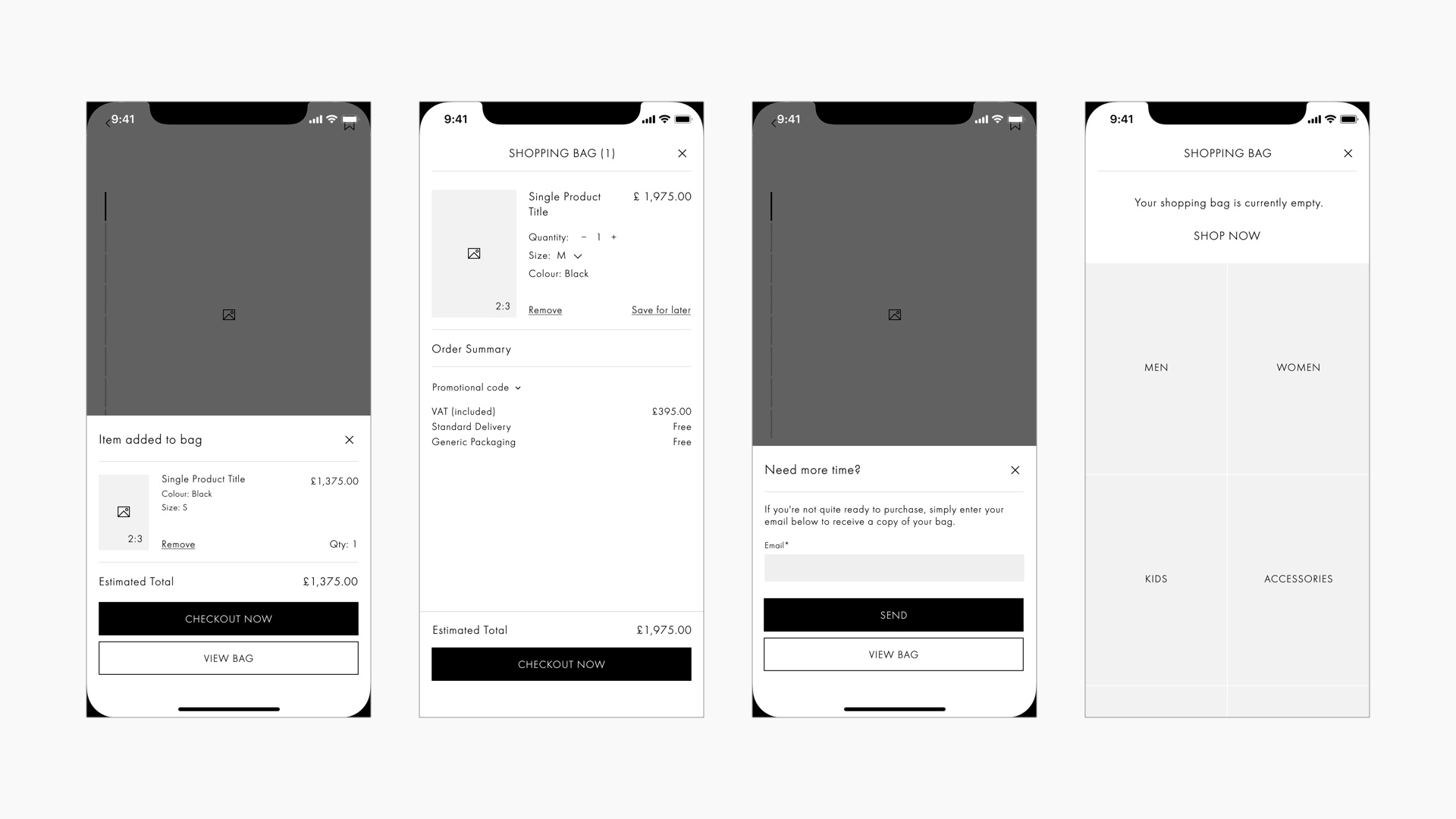
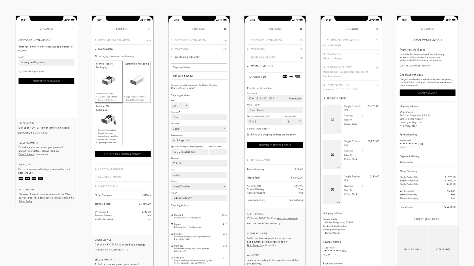
Omnichannel E-commerce
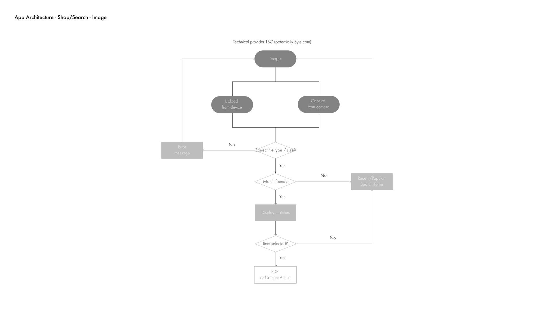
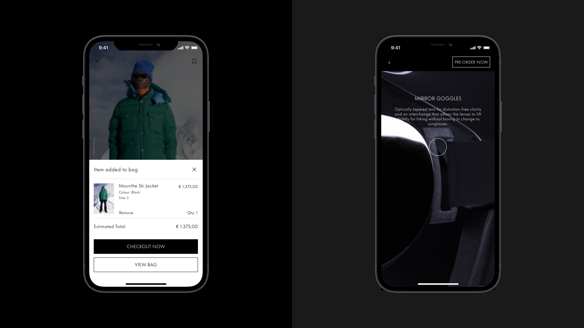
To cater for increasingly diverse consumer habits, an accessible and engaging shopping experience provides support for multiple search modalities (text, voice, image, barcode).
Omnichannel fulfilment (pre-order, buy online and collect in-store) and personalised recommendations provide further flexibility and customisation.
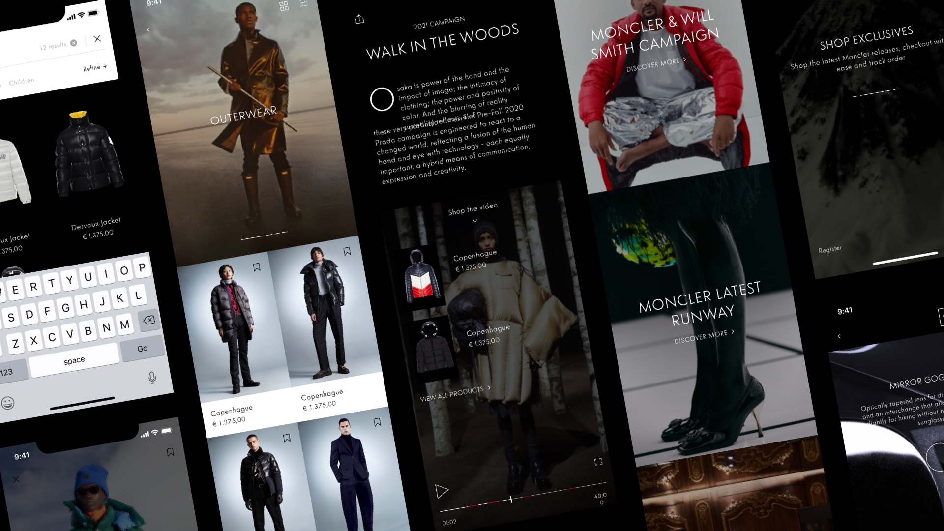
Editorial Exploration
To promote deeper brand engagement and provide non-linear entry points into the shopping experience, an open grid of explorable editorial content allows users to discover the world of Moncler.
- Users can scroll both vertically and horizontally to explore in a non-linear fashion
- Category navigation allows users to explore in a more controlled way
- Users can save articles to their own 'list' to read at their leisure
Account Management
A consolidated account experience allows users to easily manage their profile, preferences and customise their app experience.
Set-up & Approach
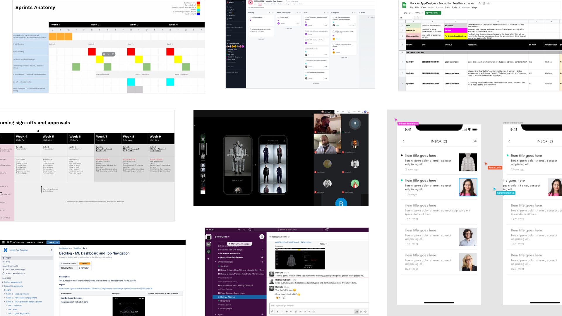
The project was divided into three sprints: Shopping Experience, Editorial and My Account. The advantage of the sprint approach was that it allowed us to deep-dive and focus on designing specific areas of the app.
Figma was used as the design tool for both UX and UI. We used its built-in collaboration tools, as well as Slack and Google Hangouts to ensure our ideas for UX and UI were in sync.
Daily stand-ups looped in the rest of the B-Reel team, and when fast feedback was needed from the client, we simply jumped on a video call and discussed directly in Figma.
Key deliverables were presented to the client on a weekly basis using a combination of video calls, Google Slides and Figma.
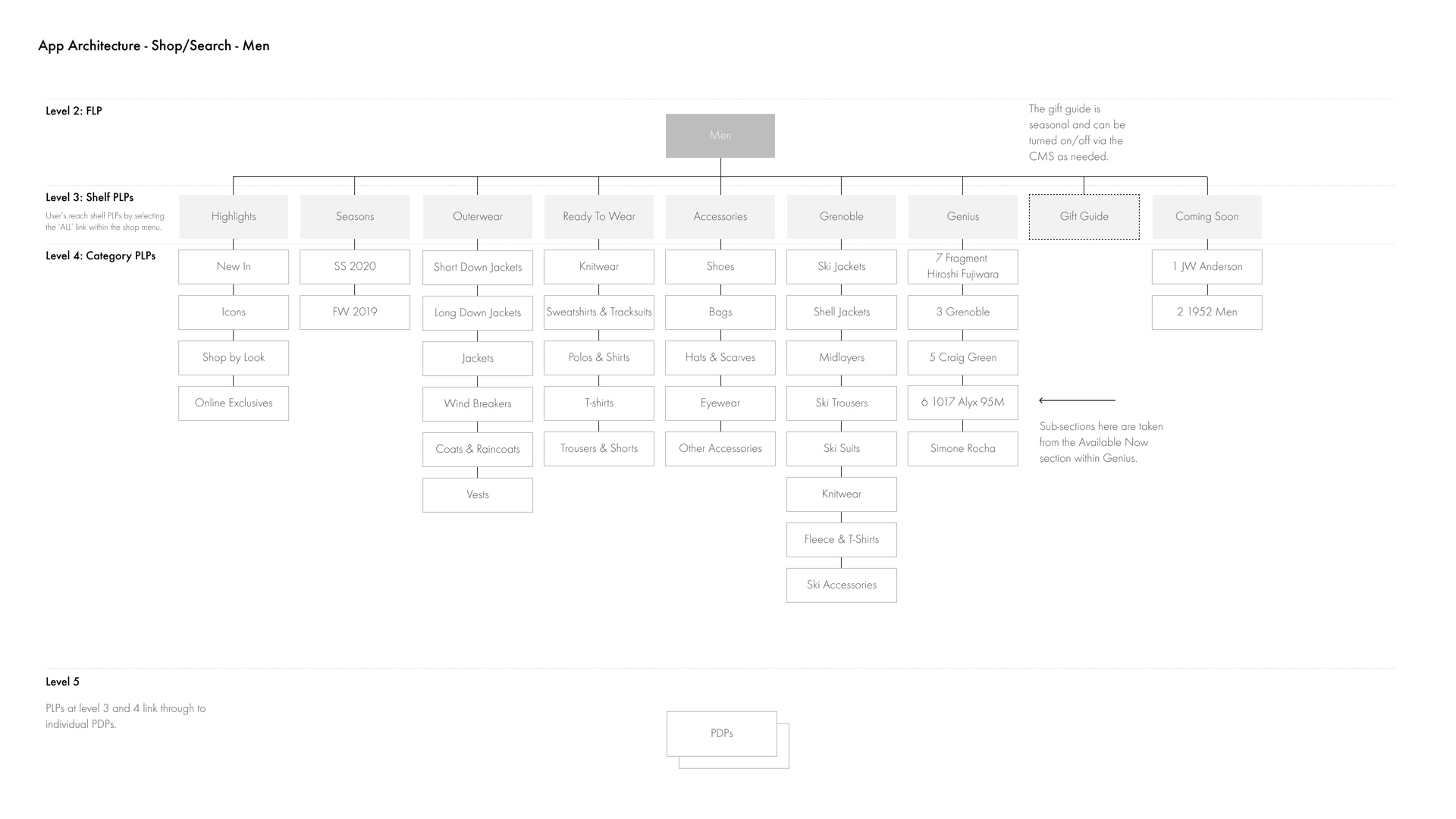
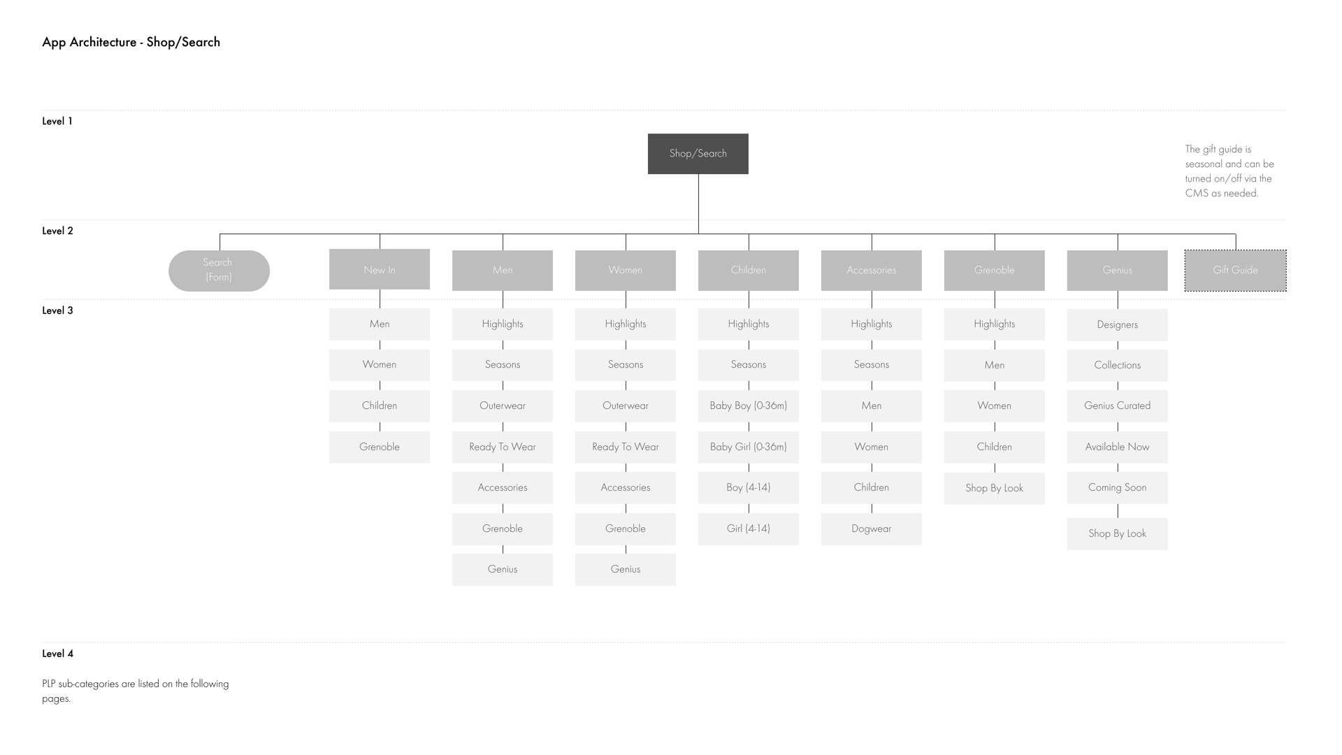
Content Architecture
The content architecture phase is often overlooked by many as it isn't as 'sexy' as UI mockups or animations. However, it is an essential part of any digital product.
One of the biggest challenges of this project was trying to adapt the existing website taxonomy to accommodate mobile functionality and usage. In addition, it was fundamental to understand the client's content strategy and how this would manifest itself across different sections within the app.
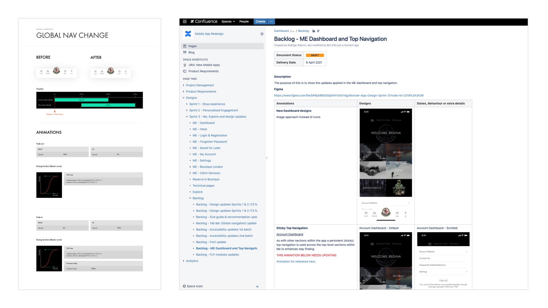
Through several 'workshops' we gained insights into the client's content and commerce goals. I created a sitemap to illustrate how content taxonomy decisions would affect the findability and scalability of information.
After several iterations and client collaboration finalised versions of the content architecture and navigation were signed off.
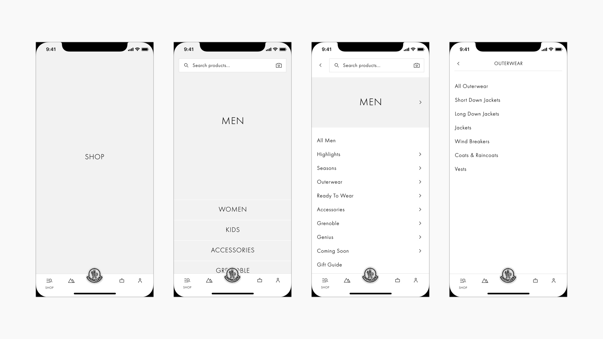
Shop Navigation
In conjunction with the sitemap, I designed a simple prototype in Figma that demonstrated how these structural choices would influence usability within the mobile app's navigation. Tap the shop/search icon to get started.
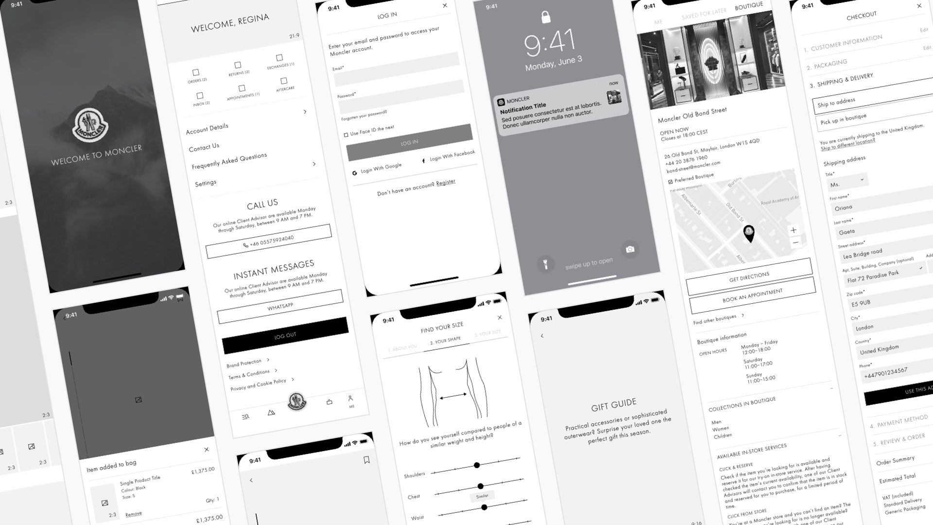
Wireframes
I created wireframes for key user journeys through the app experience. These acted as both blueprints for the UI design phase, but also as functional prototypes to help the client visualise key sections of the app and sign-off on each stage/sprint.
Figma had been used by RG/A for the website design, therefore it made sense to leverage as many of the design components as possible to kickstart both UX and UI development.
I hadn't previously used Figma and had favoured Sketch for years to develop consistent, large-scale wireframing and prototyping projects. After a few days of using Figma, it became second nature. I was able to develop a scalable Figma component library to ensure consistency across the several hundred wireframes.
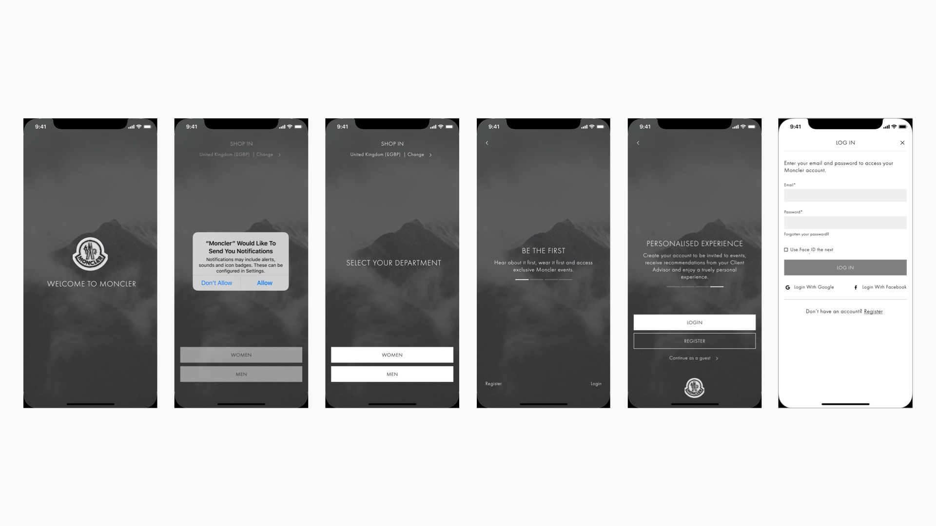
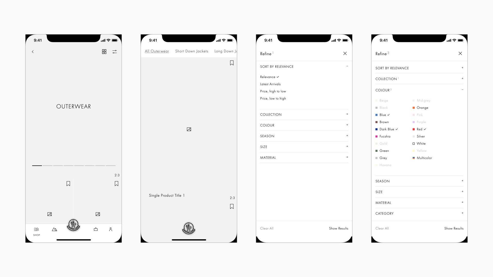
Prototyping
Alongside the extensive collection of wireframes, I also developed a set of key functional prototypes. These were essential to demonstrate functionality and provide a nod to interaction design.
Below is a small selection of prototypes from the project for you to play with.
UI Design
The UI design was led by Roma Levin, who I’d previously worked with at B-Reel on the Our Planet project.
This phase of the project was particularly challenging due to the numerous parties involved, who oftentimes had conflicting opinions. My presence ensured that we could back up our design decisions with UX, usability and accessibility best practices rather than personal preference or bias.
Development
Development was handled in-house at Moncler. Throughout the project, we had frequent check-ins with the Moncler development team to ensure they understood the UX and design intent and to check the feasibility of our designs.
I worked alongside Rodrigo (producer at B-Reel) to develop a comprehensive set of functional specifications using Confluence. These combined with annotated Figma files, prototypes and motion design ensured developer handoff was a smooth process.
Outcome
The client was extremely happy with the contribution we made to the project, especially as there were many conflicting stakeholders to manage.
An MVP version of the app was released on 24th May 2021. Due to time constraints, this only included the basic e-commerce functionality, editorial content and account management. The personalisation engine and more complex micro-interactions (such as the explorable grid and PLP to PDP transitions) were deprioritised for a later stage of development.
As with the nature of many freelance engagements, I didn't have access to the project after it went live, so I can't comment on how successful the app has been from an analytics point of view.
Initial reviews from the Apple App Store were mixed (complaints of bugs), but from the version history, it looks as though there have been numerous bug fixes. The Google Play Store indicates 10,000+ installs and one poor review. Again this doesn't really provide any clear insights one way or another.
Hopefully, future iterations of the app will introduce the deprioritised functionality and align the project more with the initial design vision.