- URL: ifit.com
- Client: iFIT
- Agency: Merchant Cantos (London & New York)
- Date: April 2021 - August 2021
- Location: Remote (UK)
- Duration: 5 months
- My Role: UX Designer
- Deliverables: UX audit, sitemap, user journeys, wireframes, prototypes
iFIT is a world leader in the arena of connected fitness. Their software and hardware solutions enable millions of users to achieve their fitness goals effectively.
Against the backdrop of the global pandemic and changing work and fitness habits, iFIT sought to increase its subscriber base through UX and visual improvement to their responsive website
Merchant Cantos were engaged in leading the project. Their creative director contacted me to work alongside the design team and drive the UX.
Discovery
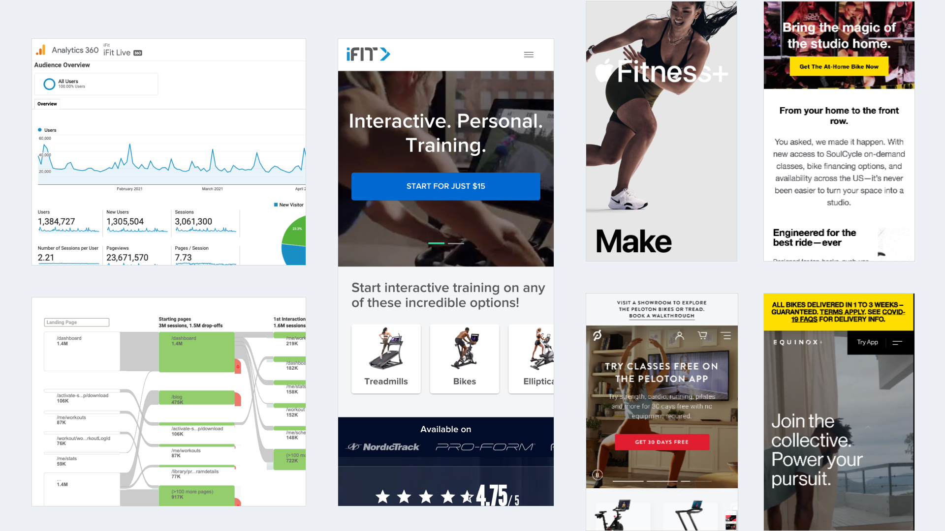
The discovery process involved examining the existing site architecture, UI, analytics and competitor landscape. The aim was to discover any opportunities for differentiation by analysing the existing content structure, brand, usage patterns and how the brand sat within the competitive landscape.
Key Findings
- The site needed to support both existing users (navigating from their dashboard, and new users)
- Confusing messaging around the various propositions: App-only, App + equipment, integrated solution
- Unoptimised sign-up journey
- Breadth and depth of course content not communicated well enough
- Limited customer testimonials
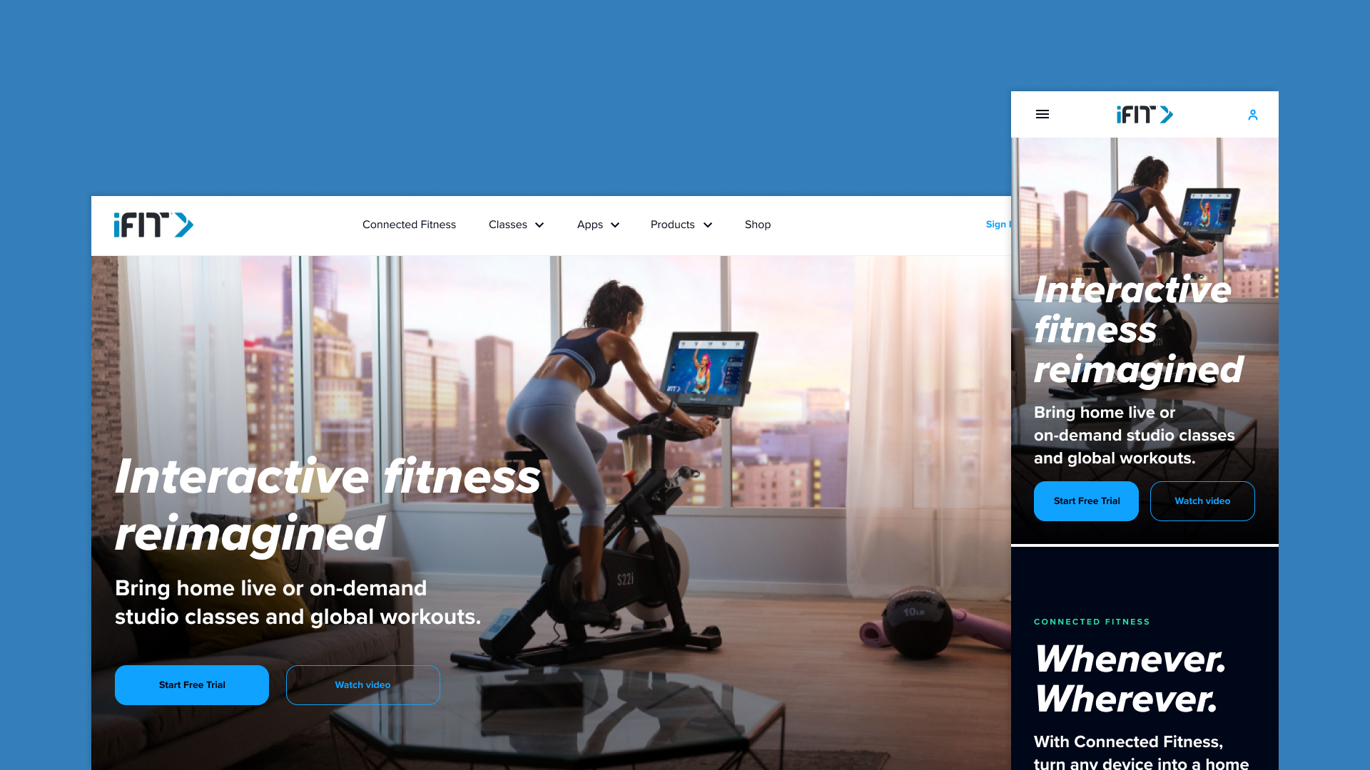
- Dated look and feel of the UI
- Competitor sites communicated propositions in a more transparent and engaging manner
Content Architecture
One of the key challenges (from a content architecture point of view), was to articulate the value proposition better. Previously a section entitled ‘Connected Fitness’ combined an overview of this concept and introduced equipment. In addition, other areas of the offering (apps and classes) only included single pages.
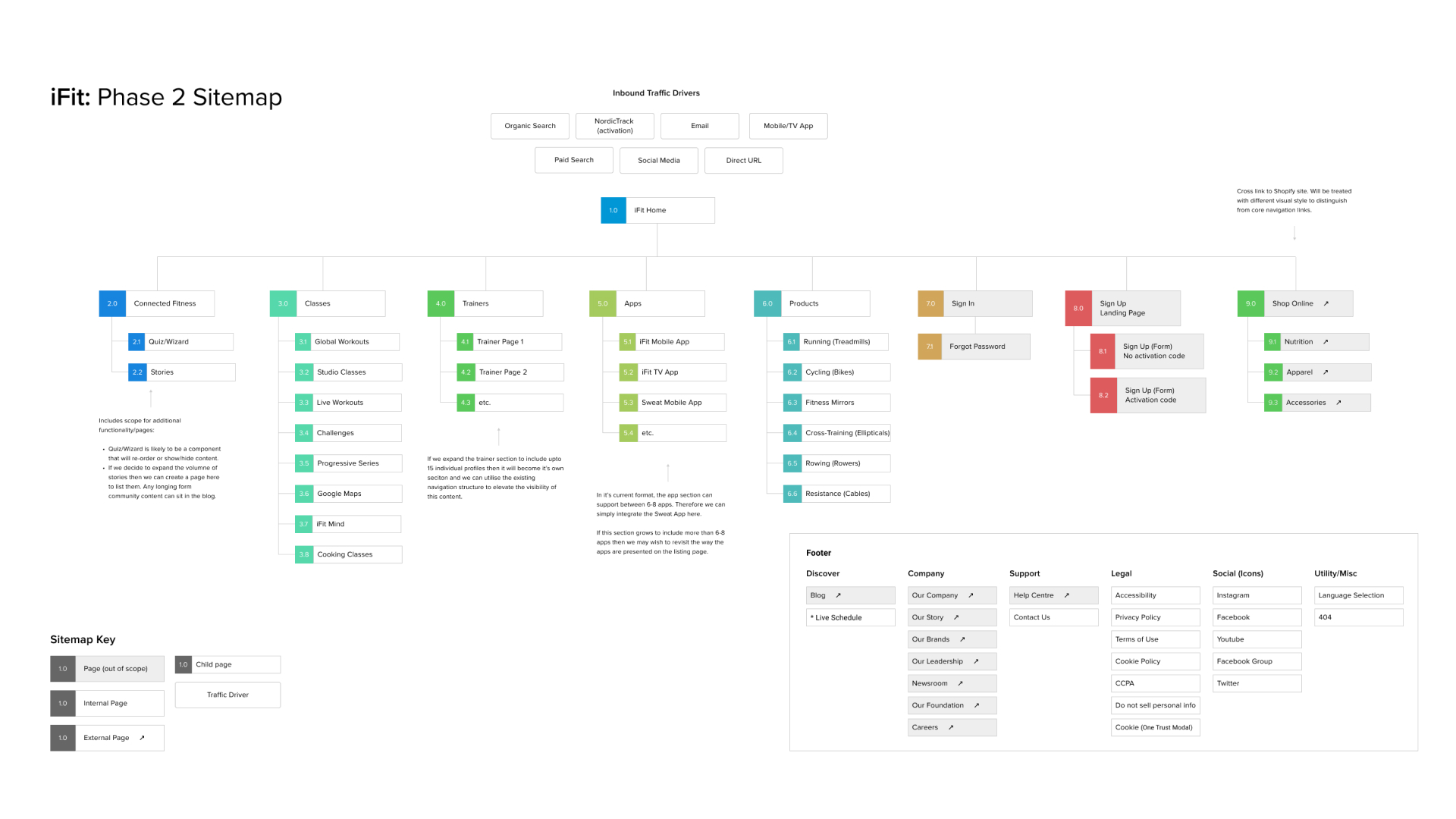
The content architecture was revised to improve the clarity of the key areas:
- Connected Fitness was reserved to just explain the concept
- A new section entitled ‘Products/Equipment’ was created to house exercise equipment
- A dedicated page was created for each class type
- A dedicated page was created for each app
- Clearer signposting for the sign-up routes
- Clearer signposting for external links to the shop and blog
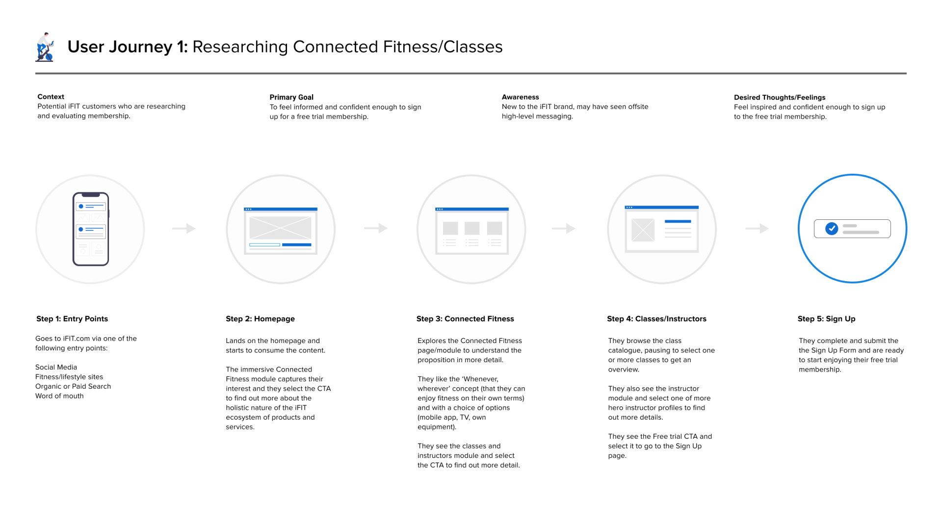
Our thinking was captured in an annotated sitemap. This was supplemented with select user journeys, to demonstrate how the structure would serve core user needs.
I presented these deliverables to the client. After several rounds of amends, they were approved and we moved on to wireframes and prototyping.
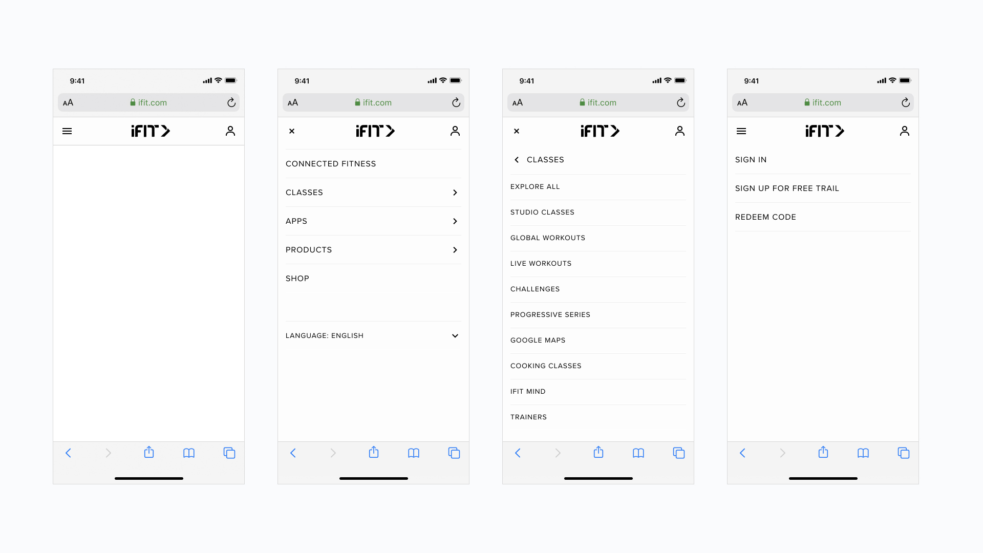
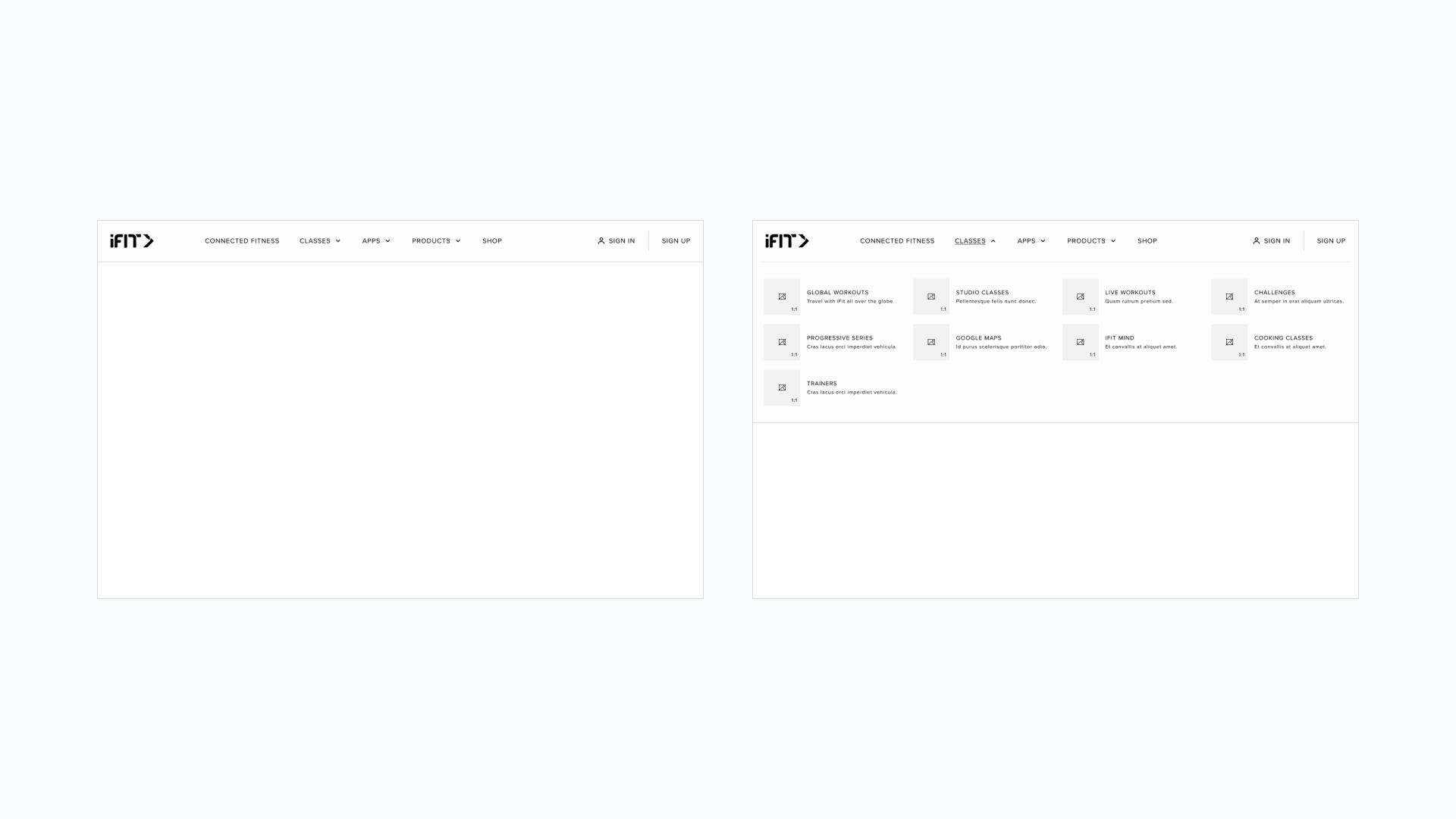
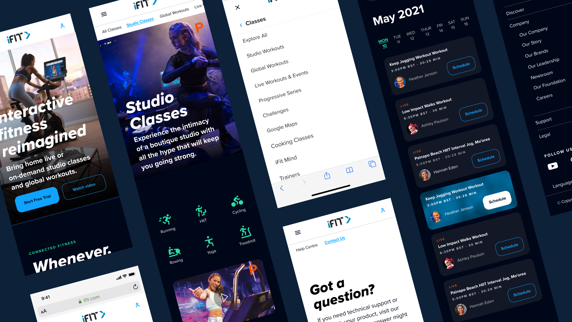
Wireframes
This stage of the project was split into focused sprints. Global assets, such as navigation and footers were tackled, followed by each section of the site.
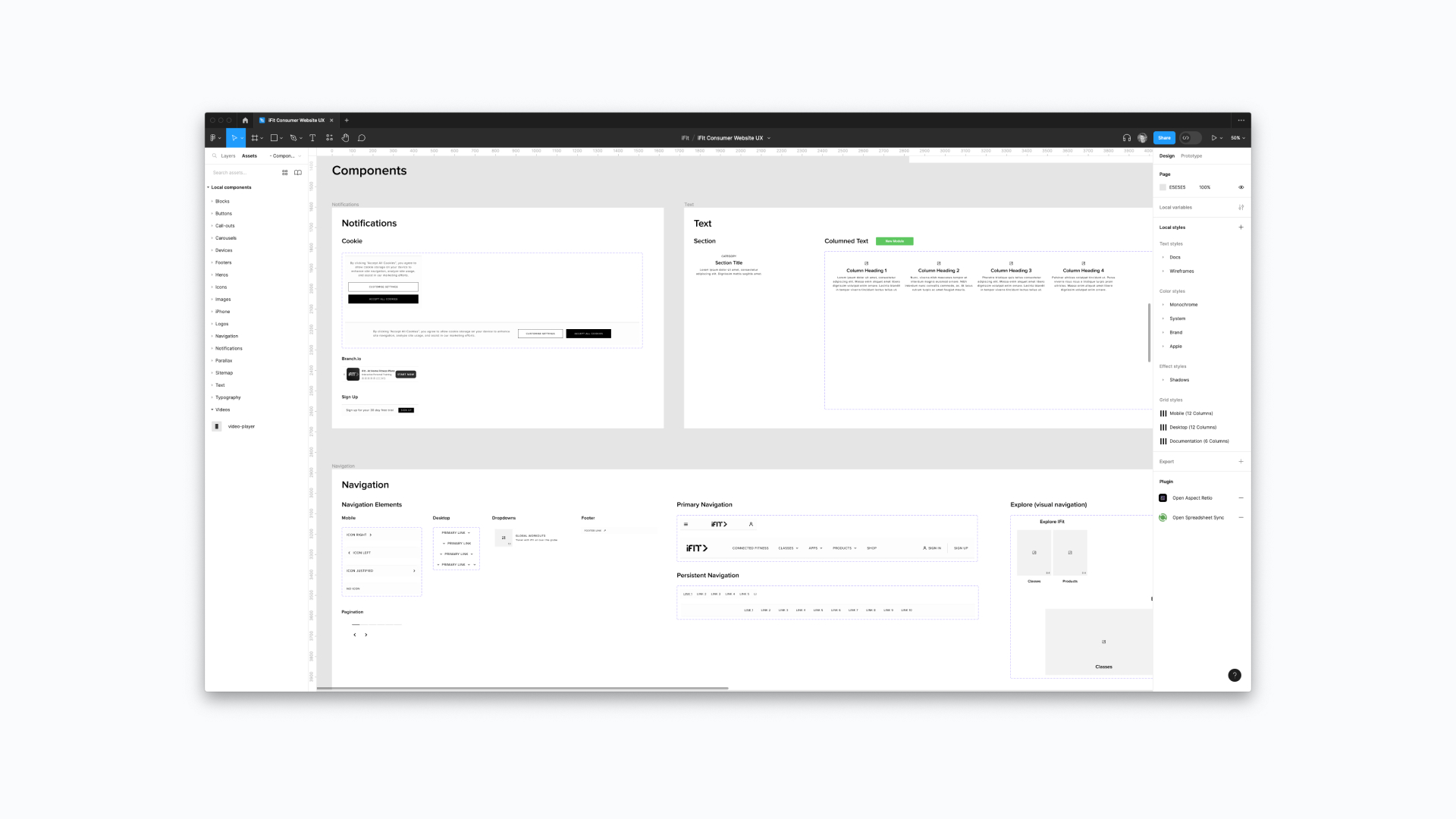
Even though UX artefacts don’t often form part of the final deliverable, I prefer to develop a component library whilst wireframing. I invest some time at the start of the sprint to establish base styles and then I simply add components as I progress.
I’ve taken this approach for years, and it has evolved as my tools and role have changed over time (HTML and PHP code snippets, OmniGraffle stencils, Sketch libraries).
It was a client requirement for the team to use Figma for the project, which was welcomed as I have naturally transitioned my workflow from Sketch to Figma over the past 3-4 years. This also meant we could create prototypes within the same design tool.
We presented the wireframes and prototypes in batches and obtained client sign-off as we progressed.
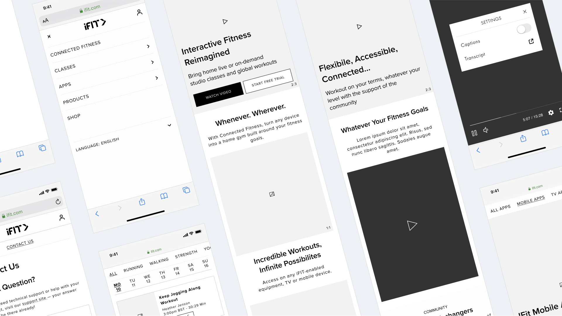
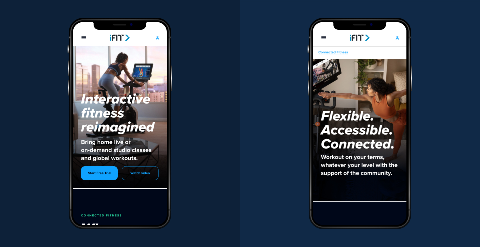
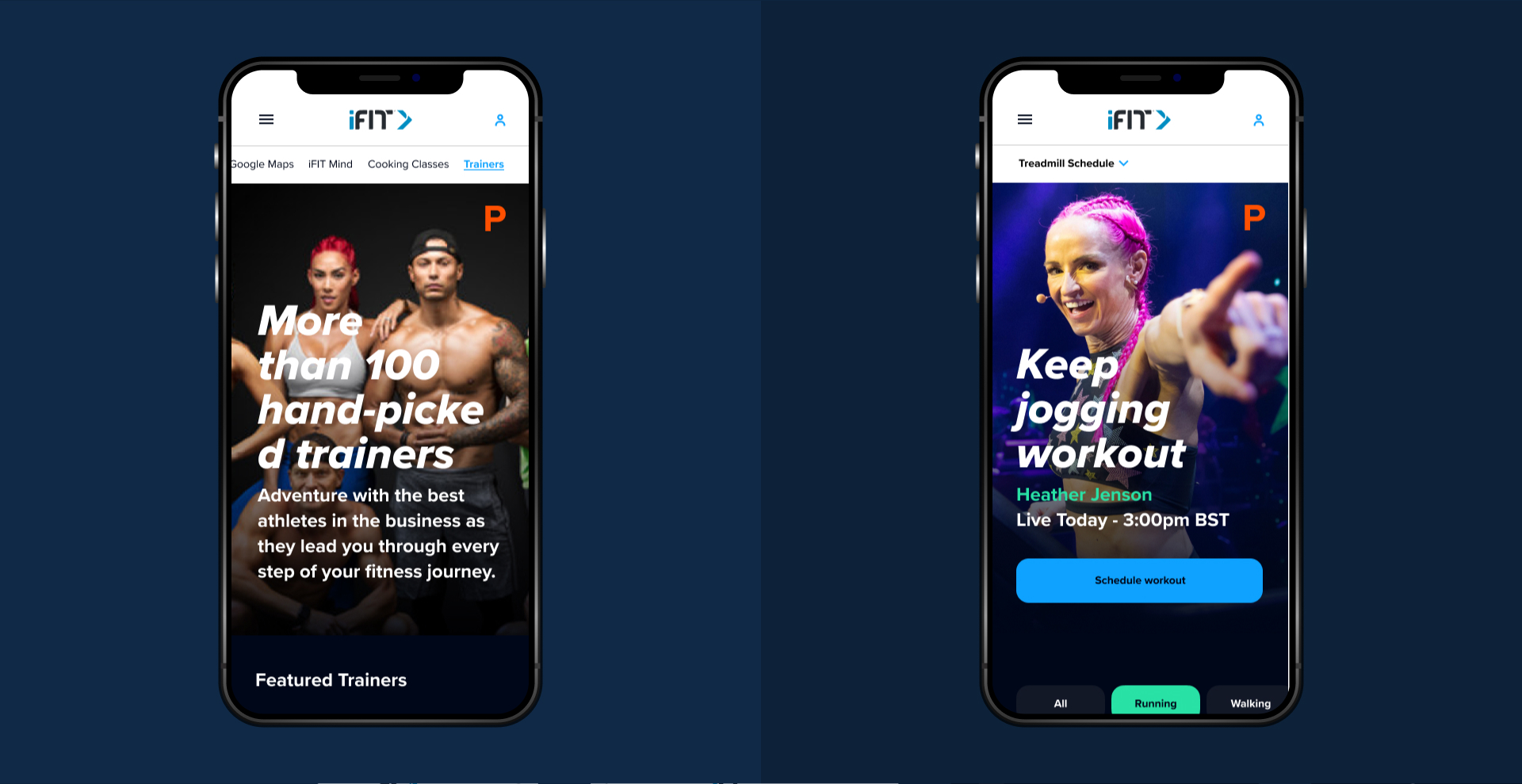
Prototyping
Alongside the extensive collection of wireframes, I also developed a set of key functional prototypes tied to the aforementioned user journeys.
Below is a small selection of prototypes from the project.
UI Design
The UI design was led by Ken Wong, with creative direction from Kat Howell. The UI design was staggered to allow UX to gain sufficient traction and avoid any blockers.
Development
Development was handled in-house at iFIT. Both UX and UI worked closely to ensure that all visual assets and guidelines were clear and that the creative and UX visions were fully understood. Using the handoff feature in Figma, alongside Adobe After Effects for higher-fidelity motion design, resulted in a smooth handover process.
Project Retrospective
The client was extremely happy with the final output of the project, as well as our thoughtful and respectful approach. The main challenges we encountered centred around coordinating remote collaboration, across 3 time zones (UK, New York and Utah).
Unfortunately, even though we drafted a user testing plan, the budget didn’t allow for the full execution of this phase.
In addition (as with many projects when you work in a freelance capacity) I didn't have access to the site analytics, so can’t compare before and after conversion KPIs.
In summary, the project was well-organised and executed by the team and that is evident in a happy client (and hopefully happy users).