- URL: carolinaherrera.com
- Client: Carolina Herrera
- Agency: B-Reel (Barcelona)
- Date: July 2019 - August 2020
- Location: Remote & Barcelona
- Duration: 12 months
- My Role: UX Designer
- Deliverables: Sitemap, user flows, wireframes, prototypes
Carolina Herrera is a global luxury fashion brand with products spanning makeup, perfume, and ready-to-wear.
As part of its ambition to become a 1 Billion Euro business, the brand launched a major digital transformation strategy.
A key component of this strategy was the rollout of an innovative, global e-commerce platform.
B-Reel Barcelona was appointed as the design and front-end development partner for the year-long project.
B-Reel contacted me to lead the UX design due to my e-commerce experience with Mulberry and our previous work together on the Our Planet website.
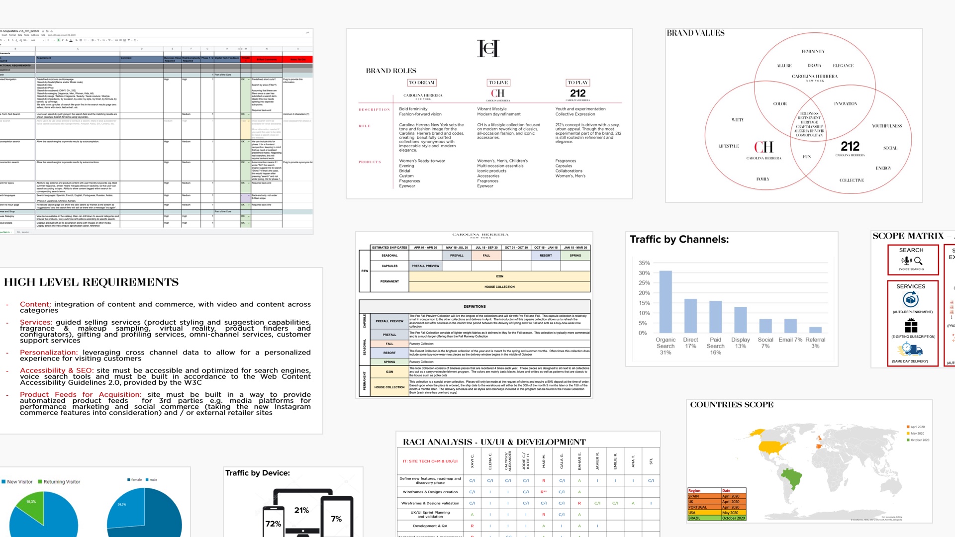
Discovery
A thorough discovery phase was planned so that the entire team could immerse themselves in the world of Carolina Herrera. This enabled us to better understand the structure of the business, key stakeholders, brand values, service proposition and product catalogue.
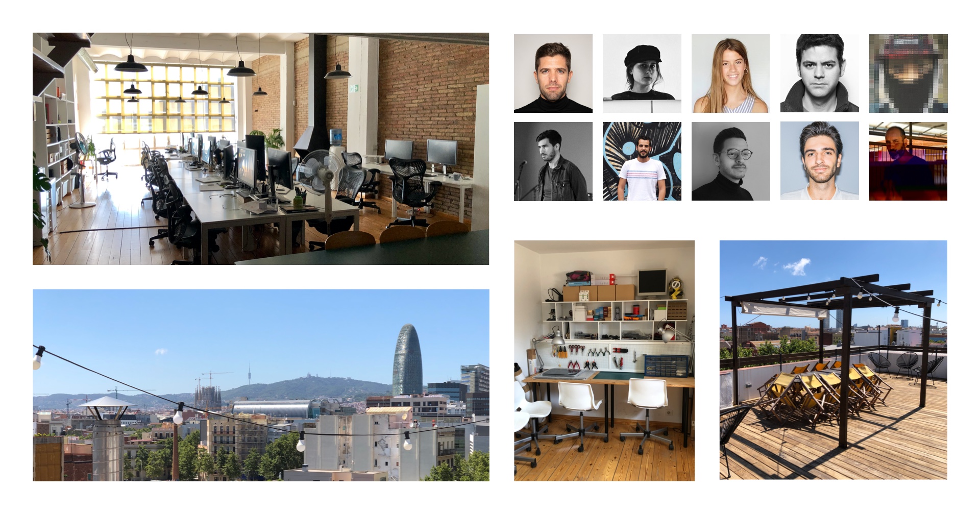
The first three weeks of the project were based in Barcelona. This was fundamental to not only being able to understand the project dynamics but also to establish a close working relationship with both the client and the B-Reel project team. The remaining 10 months consisted of working remotely from the UK.
A prioritised list of functional and technical requirements was distilled. These were then structured into six design sprints enabling the team to better focus on each set of requirements and deliverables.
You can see a few examples of the discovery documentation below.
Key Features
Five key features were chosen to best serve customer needs and act as points of differentiation from other luxury brands.
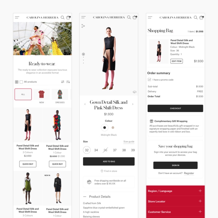
Omnichannel E-commerce
At the heart of the experience was a thoughtfully designed e-commerce platform. This maximised both conversion and omnichannel fulfilment (pre-order, buy directly online, 3rd-party e-tailer and collect in-store).
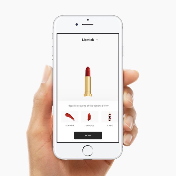
Makeup Configurator
To provide a point of differentiation, a makeup configurator was developed to allow customers to personalise makeup products to their own specific tastes/requirements before committing to a purchase.
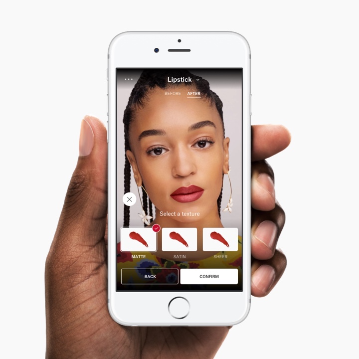
Virtual Try-On
To enable customers to be able to get closer to products, the configurator proposition was extended to offer the ability for customers to virtually 'try-on' makeup products.
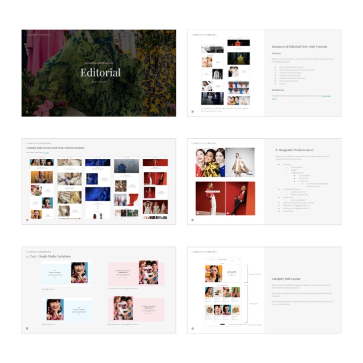
Editorial
To provide an enhanced brand experience and increase engagement, a suite of editorial modules were developed to allow the client to author varied editorial content.
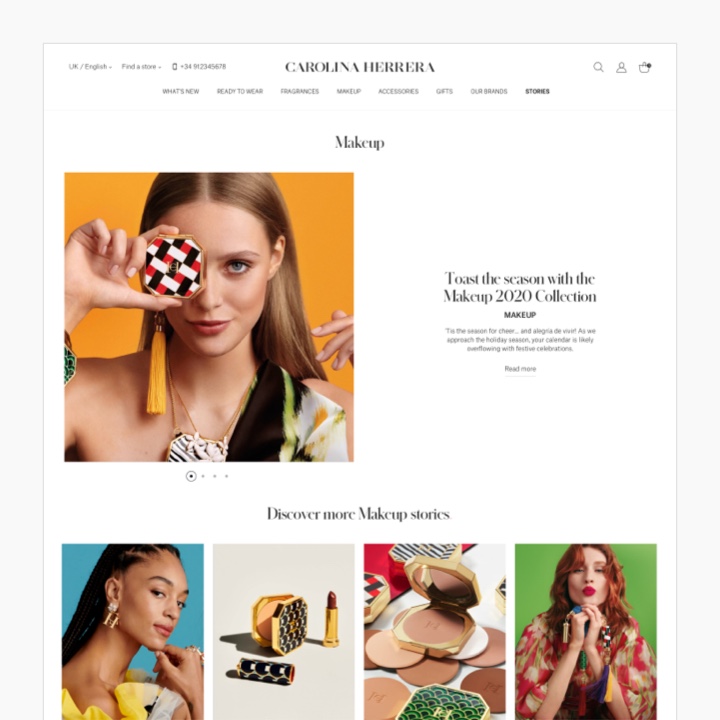
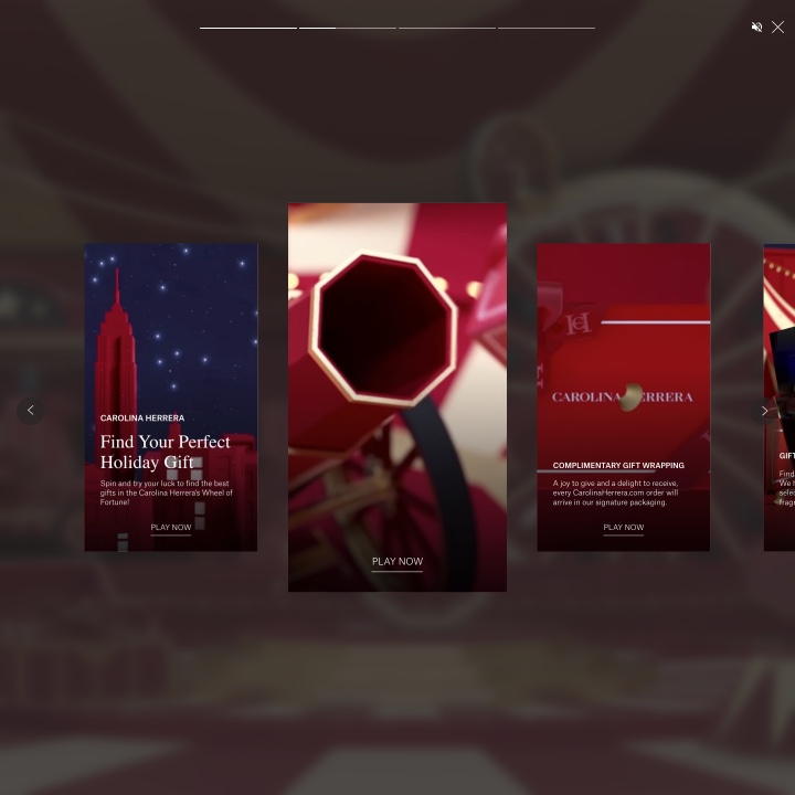
Immersive Stories
To provide an integrated editorial and product experience, socially-inspired immersive stories were developed to provide entry points into both shoppable and editorial content.
Design Sprints & UX Approach
I tailored my approach and tools to the structure of each sprint, but also to accommodate the remote nature of a large part of the project.
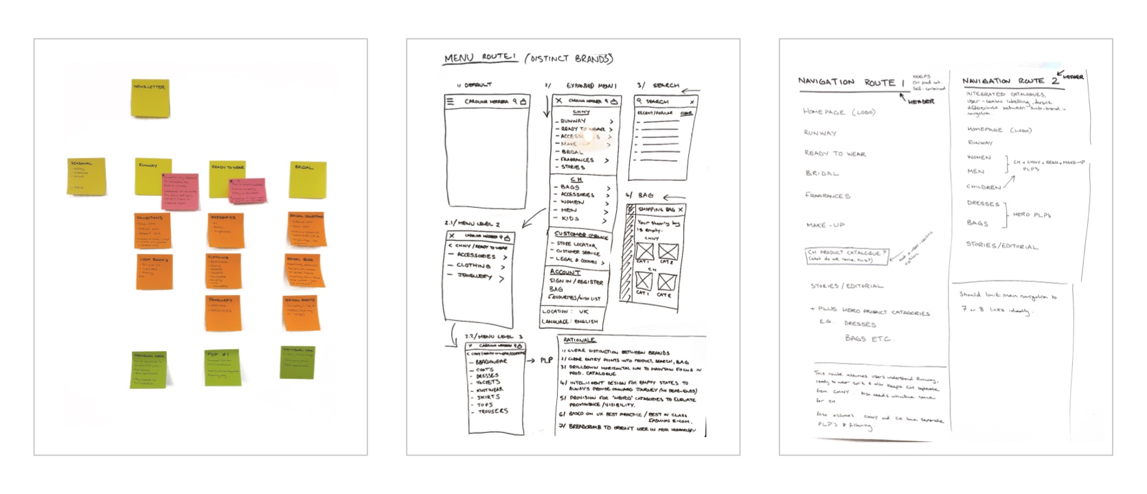
Ideation, Sketches & Scribbles
During the initial discovery phase, the B-Reel team and I used good old-fashioned post-it notes, whiteboards and paper to quickly capture and organise ideas.
Modular & Scalable
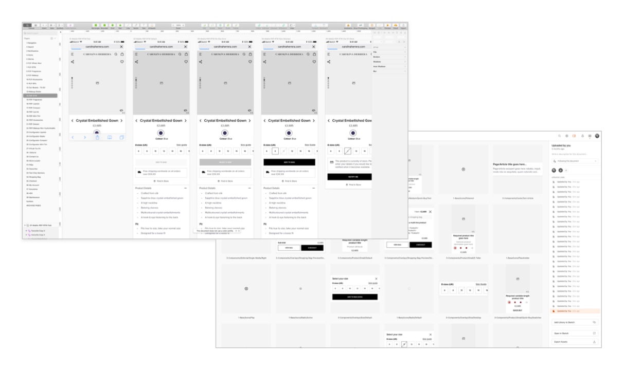
During the sitemap and wireframing stages, I developed a component library in Sketch that enabled me to maintain consistency across my UX deliverables.
This was especially important as my documents grew to include hundreds of wireframes.
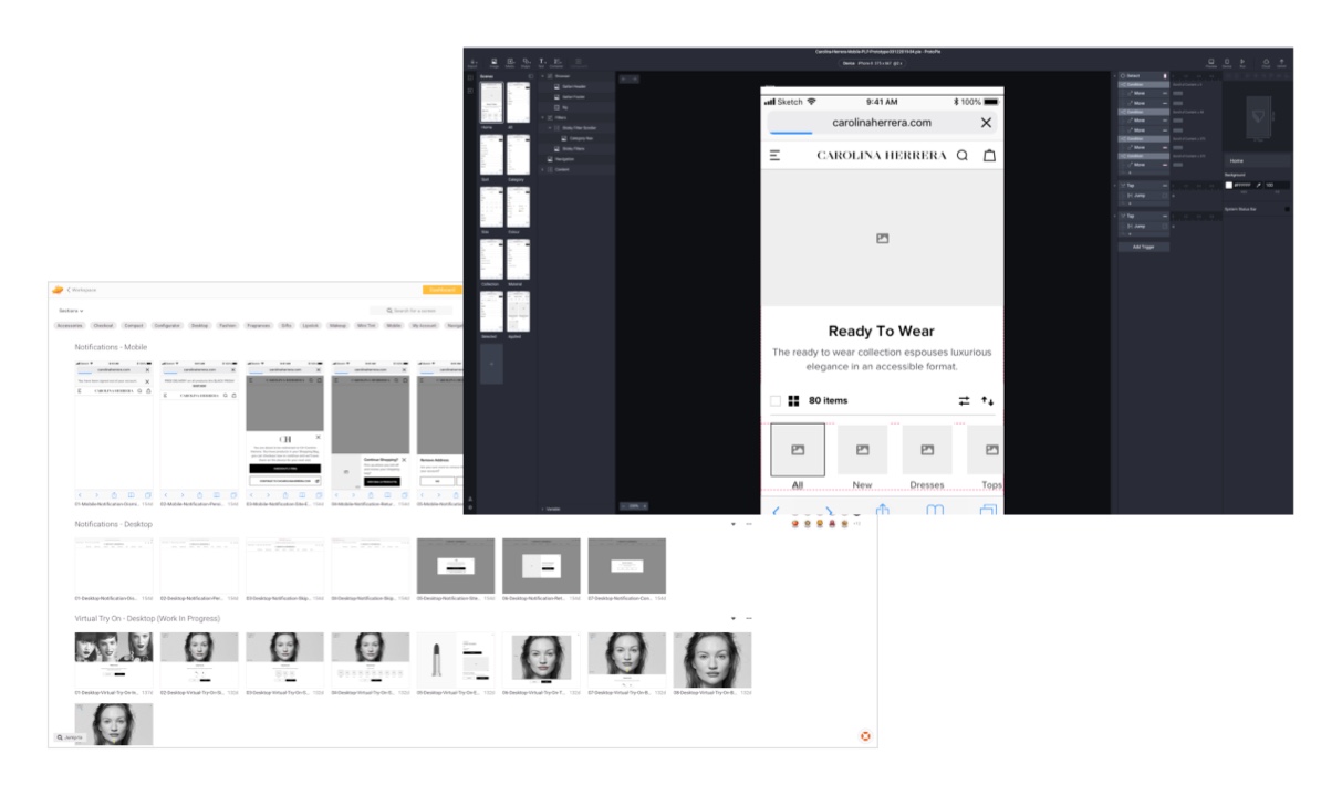
Prototyping & Handoff
Key users flows were prototyped using a combination of Sketch's built-in features and also Protopie. The level of fidelity required dictated the tool used.
Protopie's access to the native mobile camera functionality was helpful when bringing the makeup try-on flow to life.
The link-sharing functionality enabled me to easily share the prototypes with the client and quickly gain valuable feedback.
Zeplin was used for developer hand-off alongside Confluence and Jira.
Client Presentations
Design strategy and deliverables were presented to the client, most often using Google Slides as well as screen-sharing work-in-progress via Zoom.
Work from each sprint was signed off following one or more rounds of review and iteration before moving onto the next phase.
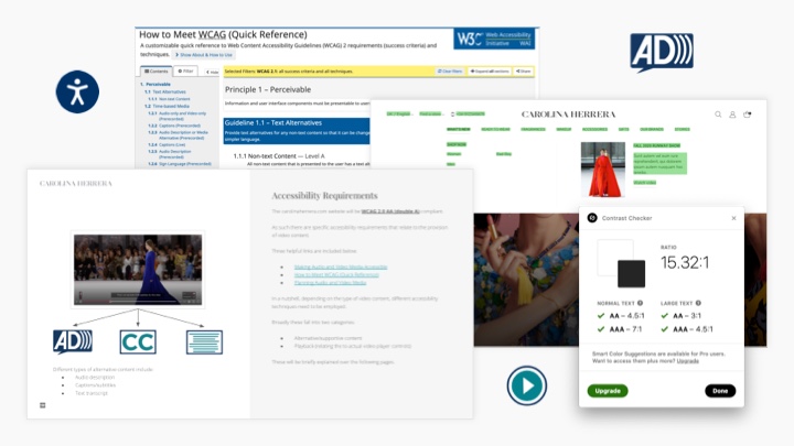
Accessibility
Accessibility was a key requirement for the client with clear guidelines to sure the site would adhere to WCAG 2.0 AA (double-A).
We embedded the POUR (Perceivable, Operable, Understandable, and Robust) principles into the UX and UI process to ensure they were considered as we designed and not retrospectively.
We also ensured that we previewed UI on-device to test for the correct tap target sizes. We also used tools such as the Stark plugin for Sketch to test text legibility and UI contrast.
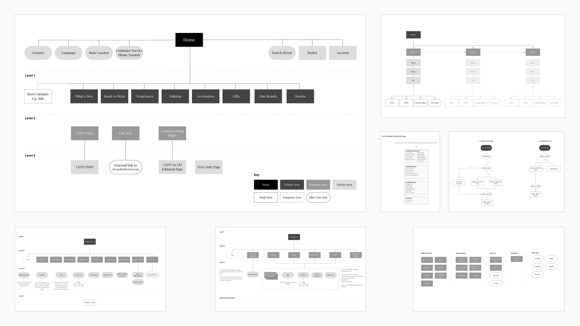
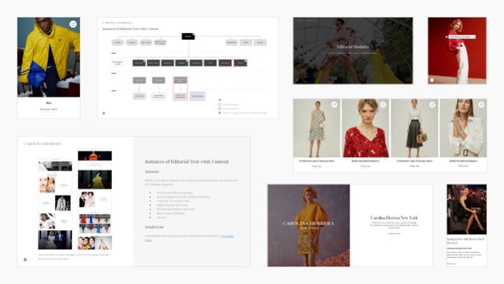
Content Architecture
The content architecture phase of a project is a fundamental step that helps project stakeholders align on the content structure and functional scope.
A particularly challenging aspect of this project was to clearly represent the multiple sub-brands (CHNY and CH Carolina Herrera) to users but also balance strategic business objectives. We achieved this through clear signposting, visual design and working with the client to establish the correct balance between (sometimes competing) sub-brands.
Below are a few examples showing different levels from the site map.
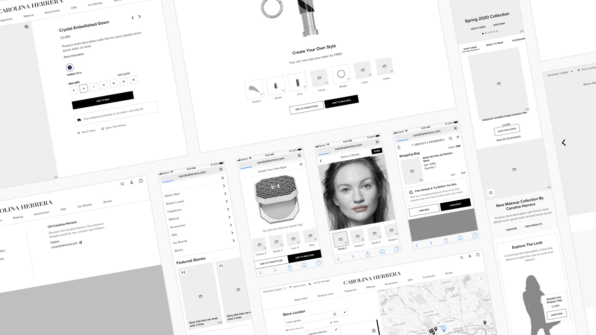
Wireframes
Many say that wireframes are obsolete, but when dealing with highly-visual fashion clients, wireframing (alongside prototypes) is still an essential part of the UX process.
Having a central source of truth for the structure and functionality of the website was essential for all involved in the project.
I tend to produce wireframes in relative high-fidelity, which can be risky at times when communicating their intent to the client. But if framed within the right context, I find this extra effort and closer attention to detail brings with it several benefits.
Clients tend to respond better to well-crafted artefacts. Also, content structure and hierarchy are better represented when you actually use real image sizes/ratios (e.g 16:9) and a clear typographical hierarchy (h1-6, paragraphs, etc). In addition, these static assets can easily be integrated into prototyping tools and go further in illustrating the end experience for user testing.
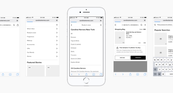
Mobile Navigation
One of the first areas I focused on wireframing was global navigation. I designed the navigation using a mobile-first approach. Select screens can be seen here.
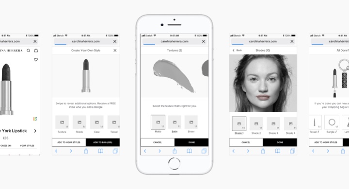
Makeup Configurator
The Makeup configurator was challenging to design as users could enter the flow from multiple entry points within the site. Also, in-store and 3rd party e-tailer solutions were also required, therefore a modular approach to the design was fundamental.
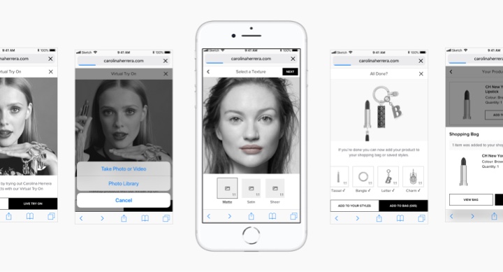
Virtual Try-On
The virtual try-on for makeup products was another key UX challenge. Similar to the Configurator, users could enter into the flow from multiple entry points.
Editorial Content Components
Rather than designing a finite selection of templates, a suite of reusable content components were designed which allowed the client to create limitless editorial layouts.
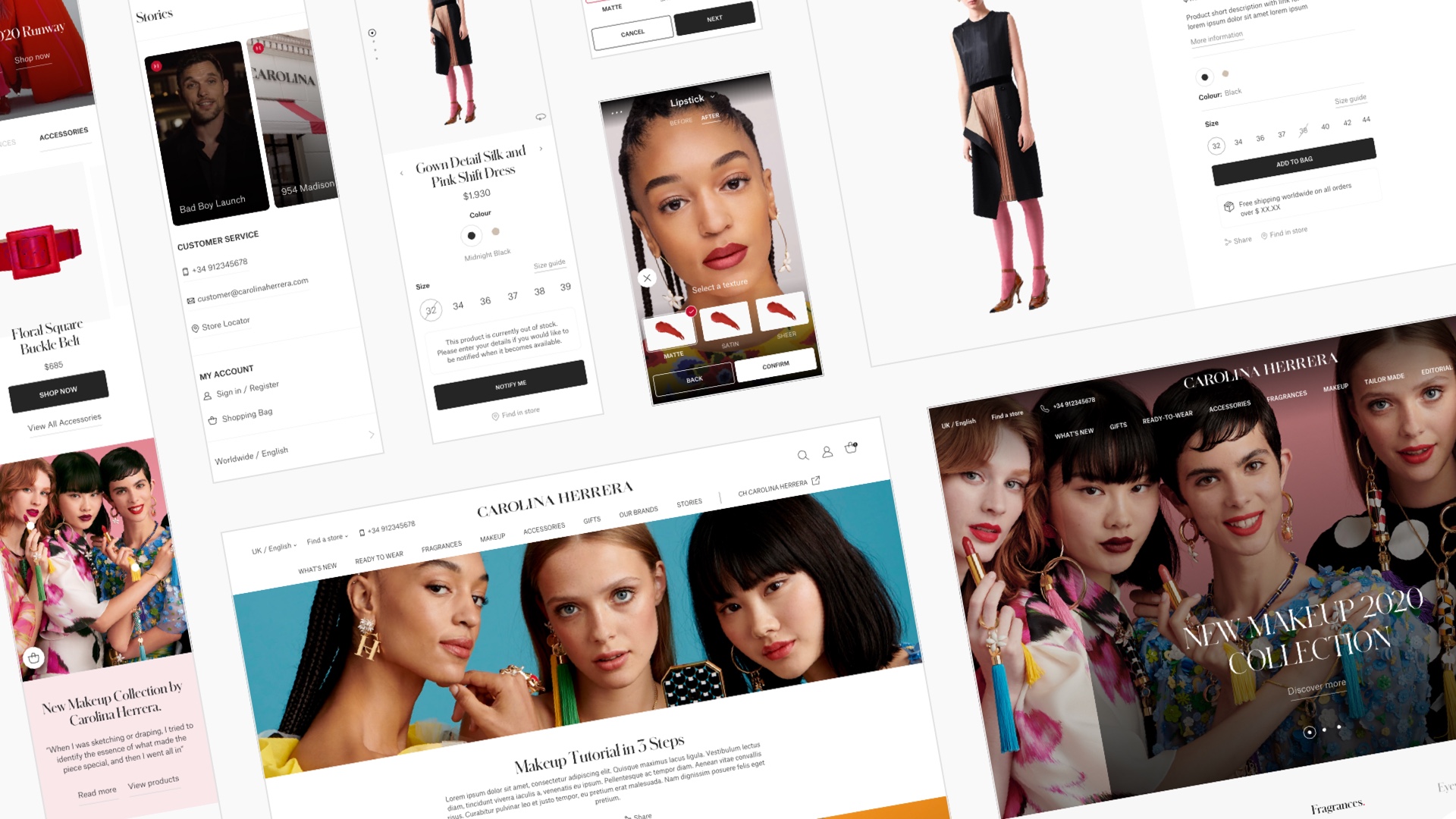
UI Design
I collaborated closely with the talented Pablo Coronel, who led the UI design. This was an iterative process, with key rounds presented to the client for refinement and then final approval.
Team
Between Christian's dry sense of humour, Marcelo's crazy creative brain and Elina's voice of reason, the B-Reel Barcelona team was a pleasure to work with over the course of the year-long project. Also swimming before work every day during the Barcelona phase of the project was a real treat!
Project Retrospective
I am extremely proud of what we managed to achieve throughout the course of this project. But as with every production, there are always challenges and improvements that can be made.
Challenges
Aside from the usual challenges of time and budget, one of the main hurdles was to establish a clear and collaborative process with the client. Briefs often lacked clarity and feedback from different stakeholders was sometimes conflicting. However, through clear communication and developing a closer relationship with the client we managed to improve this process.
Coronavirus
The other major challenge was the onset of the global coronavirus pandemic. This meant project priorities and deadlines changed significantly, but through careful planning and collaboration, the project was delivered successfully with much delight from the client.
Tools & Process
In terms of improvements to tools and process, in hindsight, I would have chosen Figma instead of Sketch. This is mainly due to its superior collaboration and prototyping capabilities. This would also have eliminated the need for creating numerous presentation decks and also using Zeplin for developer hand-off.
I would have also liked to have embedded user testing into the design process using a tool such as Maze. This would have reduced the amount of subjectivity when reviewing design deliverables as we could have based design decisions on data insights.
Site Launch
Despite the global pandemic, the site was successfully launched in August 2020. B-Reel continues to act as a design partner with the relationship going from strength to strength.
Testimonials

Mar Martin Herranz
Head of E-Commerce, Carolina Herrera
"I worked with Ben for Carolinaherrera.com relaunch project and I can say he is such a professional who really understood what we wanted to deliver with our new website bringing his UX expertise into the project. Ben is a very organised person who was delivering always on time. This is crucial when you have such a big project with tight deadlines. Hope we can work together in the future Ben! It's always a pleasure to work with people like Ben."

Elina Nilsson
Senior Producer, B-Reel Barcelona
"Ben was a key piece of the team working to launch the Carolina Herrera eCommerce platform. His ability to understand the consumer and providing solid UX work was crucial for the success of the project. It's a pleasure having him on your team and I would love to collaborate with him in the future."